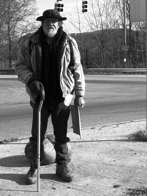
This is one of several "homeless" men that camp out around the Interstate adn take turns begging money and food, and stuff. He agreed to let me take his picture, and I paid him $5.00 for it. Does that make him a professional model now?
Statistics
Place: 25 out of 147 Avg (all users): 5.9779 Avg (commenters): 6.3600 Avg (participants): 5.9455 Avg (non-participants): 6.0000 Views since voting: 1723 Votes: 271 Comments: 26 Favorites: 2 (view)
*Composition (content)* The composition is not ideal. I suppose that the picture reflects the title, the life in the shadows. But the position of the man in relation to the sun is far from ideal in my personal opinion. The difference between the dark and bright area of the jacket is too big and detail is lost in the shadows. The shadow over the eyes takes some of the emotional aspects away. I don't think that is was necessary to change the position, this might also have been overcome with a bit of fill flash. Keep most of the shadows, but brings also some detail back. As already mentioned by someone else: Shoot from a slightly different angle or position the subject in a different place to get a better position in relation to the traffic lights and to get rid of the sign in the upper right corner (or include more of it). The position of the subject in the frame is good.
*Background* The background is not bad, but it also doesn't tell much about the subject. You might also want to try a wider aperture (F4-F2.x) to blur the background, to focus the attention more on the man. It also blurs the trees that are not very interesting at this time of year. The lines in the background provide good perspective/depth.
*Camera Work (Technical)* Already mentioned: Try fill flash (and perhaps exposure compensation in combination with the fill flash or on the flash itself). Try to shoot with a wider aperture to get a narrower depth of field, blur the background. Otherwise the exposure is good, focus good, perhaps a bit oversharpened (could also be the result of post processing).
*Digital Processing (technical)* Perhaps a little less sharpening. B&W is good. Compression is good, no Jpeg artefacts.
*My opinion* Interesting subject, but the background is a little bit boring. Can be improved technically. There is no direct story and the subject expresses little emotion.
Strong image, strong content. Minor point - positioning of yourself and/ or subject means that the traffic lights appear to be coming out of his head. Exposure and/ or (deliberate?) contrast treatment/ dark tones don't appeal. 8, Kavey
Okay, but composition kinda sucks. Lights comin' outta the guys head. Sleeping bag behind his knees. Etc. These things are MORE of a problem in black in white. Probably not a problem at all in color.
I think this would be better if you could see the sign he's holding. Or if he was looking toward traffic instead of the camera. Great camera work, though. muckpond.
A good dignified portrait. Certainly better that you can't see his cardboard sign.
The lighting on his face is really harsh with the shadows - not sure if you wanted that or not. Maybe taking it from a direction with either sunlight full in his face or full not in his face would have let you expose more for him ?
Another thought in general - pay attention to the background - even though it can be hard to do. He has a traffic light poking out of his head.
I realise this is a very difficult and emotive subject choice and is difficult to think of all this sort of stuff while dealing with just taking the picture. A very good entry.
I thought the garbage bags were part of his pants, and I was wondering what was wrong with his legs, but really he's just standing in front of them, but this mass confusion causes me to dislike the shot! What is he holding too! Is he a sex offender!? What a weird hat!
I like this very much. That it is B&W really adds to the feel of the picture of this man. However, I think if you had been able to get a candid shot of him it would have had even more impact.
Awesome job! One of my two top picks this week (three if you count my own! :) This is just great -- I can easily picture this in a newspaper along with a feature story... perhaps about how this guy just hitchhiked cross country or something. Again, congrats -- a big fat 10 from me! -- alansfreed
The hanging traffic signals behind his head distract from the compostition as does the back of the sign in the upper right corner. I don't know what was to the left in the background, but it might have been a better angle and better light on the subject. Overall not bad but could be improved.
I like the b&w, but his face is a bit too dark and the sign on the right could be cropped out. Also it looks like the light signal is growing out of the top of his head. Over all I like the shot, I'm not slamming it. Really it scores well with me and is sure on topic!! Justine
When using the term photojournalism, you would think that most photographers would be able to grasp this concept...though in most of the pictures I have viewed I didn't see much of an essence. This pic. makes a statement that most would be afraid to make...people seem to only like pictures of happy things of naked things...I like this pic. Ilike the black and white contrast
Composition: Subject Placement, Cropping, Background8, Technical: Focus, Exposure, Lighting, Processing7, Appeal: Is it Interesting, Motivating, Etc.? 7, Total Averaged Rating7. Autool I see a story here butyour title doesn't support it well. IMO the relationship between the title and picture are key elements this challenge.
Who is that man? What does he do? It's a great portrait of a man - thats for sure! Guess there's a reason, I just don't know! So - 8 for a good portrait! KAOS
Looks like a real "on the road" journalism shot. Definitely not staged. Has a few technical difficulties like hot spots (to be expected), but it fits the topic well. Like the B&W. ~indi






 Add photograph to your favorites
 Add photographer to your favorites

 Photographer found comment helpful.


