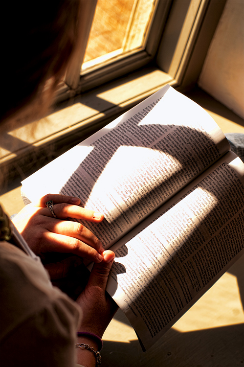
The light is direct sunlight. I guess people dislike it - I don't understand why.
[Apr. 16th, 2010 01:17:59 AM]
I take back what I said on the 14th - I was having a photographic crisis. I hope I don't offend anyone. (I like how this became a journal... Maybe I'll start my next picture w/ "Dear Diary")
[Apr. 20th, 2010 12:01:11 PM]
5.25 as of now... i guess it's not going anywhere. I'm guessing that the lack of color pushed people away from the picture. Perhaps the direct sunlight also... but I figured that was the challenge. I guess I will take the challenge idea w/ a grain of salt and just submit the best photo that i take each week w/o caring about the challenge. Seems to be the way to do things.
[Apr. 20th, 2010 12:08:44 PM]
...and AperatureJack - your "11" made me lol. Thank you for the vote :)
Statistics
Place: 80 out of 158 Avg (all users): 5.2663 Avg (commenters): 5.5000 Avg (participants): 4.9672 Avg (non-participants): 5.3986 Views since voting: 1085 Views during voting: 305 Votes: 199 Comments: 6 Favorites: 1 (view)
This photo is over exposed where you want it to be properly exposed. What was the subject? The book or the hands? Both are over-exposed. That's why this didn't do well, not because it lacks colours. Not because it's a bad photo. Not because people don't like sunlit images.
I'd have to agree with previous commenters. This light is really harsh and you have a lot of blown highlights. The fact that they are mainly in the text of the Bible makes them glaringly obvious unfortunately. The highlights on the left hand are blown out but its not quite so jarring.
Of course there is a but...
The cross you were trying to convey in the image was a great idea. Trying to get a defined shadow AND have nice soft light? yeesh.... I think that's a lighting problem that may be unsolvable at least using natural light. Maybe a reflector to provide some fill to the areas outside of the direct sunlight to balance out a bit and hopefully your scene would be less contrasty. It would probably involve a different pose and composition though.
To be honest, I think that the exposure lost you marks and the idea you were trying to pull off actually brought your score up.
You've just got too contrasty a scene here to attempt to get a normal type of exposure (not embracing the super contrast). I'd consider almost like a low key style, high contrast. The colors are washed out from the direct sunlight, so I'd go BW instead, as well. Crop a bit off the right, it seems to be awkwardly placed for some reason. Here's what I mean (all basic legal).
Good topic, however the shot is a little too brightly exposed. That spot right in the center of the left page is white hot. It's tough to expose such extreme shadow and light well, but you did a fairly good job here.





 Add photograph to your favorites
 Add photographer to your favorites

 Photographer found comment helpful.


