INITIAL RESPONSE: Not specifically appealing to me, a 'documentary' picture.
Composition/Background/Exposure :
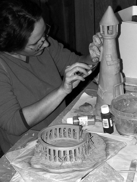
I think the light is not very appropriate, it cast very strong shadow and the person it too 'dark'. I would have prefered to see better the face of the person to make it more 'live'.
TECHNICAL : The depth of field is appropriate to show all the elements. You did not oversharpen which I like.
Maybe you could try to adjsut the 'curve' in photoshop to enhance the details in the 'underexposed' part of the picture ?
MY OPINION ON THE PHOTO - I do not like specifically that picure, even for a documentary. to me this picture describe the activity correctly but it miss something that would make it really interesting.
This is a photo I wouldn't be surprised to see in a newspaper. I don't think it's front page material, per se, but I could see it further back in the local or arts pages. I like the way there is some completed work and some work in progress. The only thing that would dramatically help this pic would be the woman's face shown a little better, where she would be a little more easy to recognize if you saw her in the grocery store. Good job - Inspzil
Good subject, but the flash leaves some things too bright and some too dark. I also think I would have cropped out some of the foreground clutter that doesn't add anything to the shot. 6 nards656
Interesting photo. I think this definitely fits the challenge very well. I see a few problems like the exposure of the top left corner is much darker than lower right corner. There's also a strong diagonal line cutting the photo in half which takes a bit away from the photo. I think a flash was used which is why the photo came out like that. I longer exposure and a tripod would have been a good thing to use.
Good title and shot. B & W works well here, but with the paints showing maybe color would have worked better. Love the soft focus. Good composition. Good execution. Nice job. PTL7






 Add photograph to your favorites
 Add photographer to your favorites


 Photographer found comment helpful.


