I just find it funny and there are examples of this all over the comments of photos where one voter likes one aspect of the photo and another doesn't like the same aspect of the photo... in this case the textured background. How do you please all the people all the time??? lol.
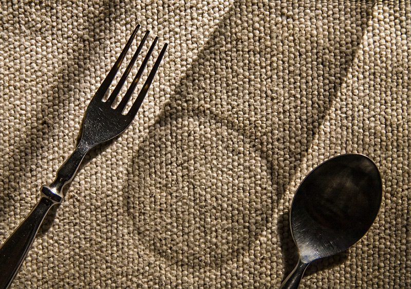
In an image that derives a great deal of its energy and impact from the shadow of the glass, the shadow to the left of the fork running diagonally through the picture is a major distraction. The good thing is that the remainder of the picture is almost strong enough to keep your eye away from that eye (but not quite). Because the silverware looks so dark, it isn't very appetizing to think of using it to eat.
For me, this is a compelling picture. Creative, simple, mixed textures, nice tones.
I actually like this shot. It took me a few seconds to change my mind but now I think it is nice. I guess the part that makes it work is the texture of the background.
3 clear elements and I like your idea. The shadow glass is very nice.
I do think that the shadow line next to the fork should be removed. It sort of adds a fourth element to the picture and is distracting.





 Add photograph to your favorites
 Add photographer to your favorites

 Photographer found comment helpful.


