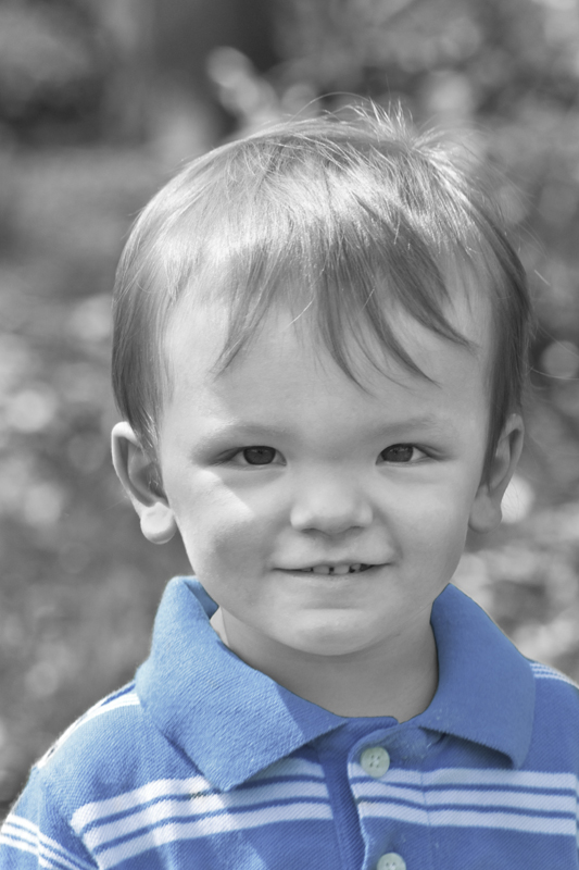
I really don't get the selective desaturation here. The colour use seems to suggest that the shirt is more important than the boy. I've seen this done commercially, but to me it doesn't make sense. I'm sure this would look really good in colour though.
I love the expression - and i think in just black and white it would be a lovely image- or...if there was perhaps at ouch more color to balance it / eyes - rosey cheeks or even some tone to the skin desaturated to draw the eye back up- but instead my eye keeps going to his shirt instead of focusing and remaining on his adorable face :-)
Bold move to keep the shirt saturated, as it'll probably get hit hard by the anti-desat movement that's about these days.
Personally, I would have kept the eyes saturated as well to help balance the photo out, although if they're hazel/brown/etc. it wouldn't have mattered much. In which case I would have kept the shirt B&W. There's a bit of an issue with composition balance as well, as the upper part of the photo doesn't really add much, and takes away from the feel.
Not saying, of course, that you should do these things, but that's how I feel when I look at it.
I am sorry, but the selective desaturation in this photo seems pointless to me. What is so special about that blue shirt to draw all the attention to it?
I really, really dislike the selective saturation here - it manages to give a sort of deathly cast to the child's skin. Shame, as it is otherwise fine.






 Add photograph to your favorites
 Add photographer to your favorites


 Photographer found comment helpful.


