Honestly I don't find veggies or flowers etc. against black very interesting, but it seems pretty popular.
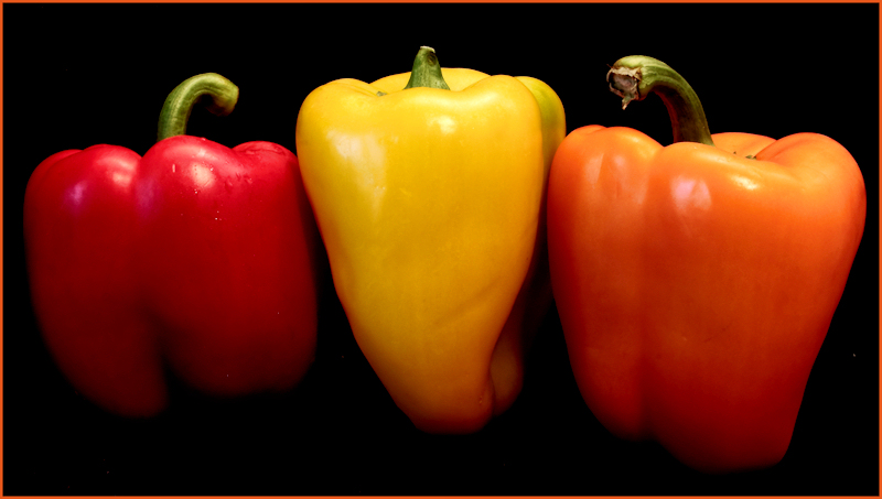
However I like the fact that you used imperfect peppers :)
alright this is going to sound stupid...but because the pepper in the middle is so much bigger...I see that first...possibly if you had turned them on there sides to see the tops only that would have been a better balance...you do have excellent focus and processing...
I was a bit freaked out by the (CW) in the title because of the recent voting scandal. I was thinking there was some collusion going on and didn't like it too much, especially since I had seen two images in the PTA challenge recently with the same thing. I was thinking it was a sign to show who you were... But I looked it up and found that it stands for comments wanted. So my initial comment is that I didn't like this experiemt in communicating with the voters through the title.
About the picture... good diffuse lighting. I think you might need some reflected light hitting the bottom of the peppers to light them up a bit more. Great color!






 Add photograph to your favorites
 Add photographer to your favorites


 Photographer found comment helpful.


