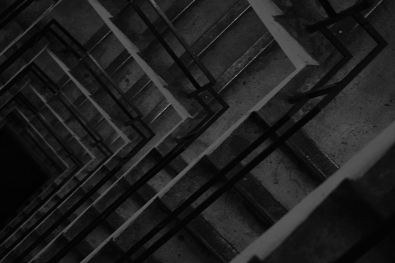
I was going to comment that this was too dim and should have been brightened up, but then I found myself looking deeper at it and of course, that was what you had designed by making it dim. Extra pointage for making me pause to look longer.
Very interesting shapes and lines throughout this image. The rotation works well as the cropping of the shapes and the diagonal lines through the image are really good.
I'm going through the entries, stopping at those images I feel have had the benefit of an unconventional eye and dwelling a little longer to try to see and appreciate what you saw. This is one of those images.
Positives: I like the repeating geometric pattern and the angle of rotation of the lines relative to the frame.
Critical stuff: Too dark really and a little bit blurry too.
Overall: I like the vision but I'm not so keen on the result.









 Add photograph to your favorites
 Add photographer to your favorites


 Photographer found comment helpful.


