CRITIQUE CLUB CRITIQUE
by karmat
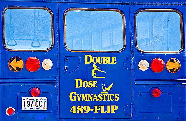
Compositionally, the image is a bit flat/static. It "fills the frame" but seems a bit too tight to have the eyes "roam" any. Also, it isn't quite straight one so it feels tilted even though the words seems straight.
Technically, the colors are really good. That bright blue is a great attention getter and the yellow provides a nice contrast. Also, the focus and exposure looks pretty good, except that resizing may have left some artifacts around the tag and lights.
Overall, a "cheerful" shot that definitely meets the challenge. It just lacks the "sophistication" that some of the pictures at the top had.
If you have any questions, let me know, and best wishes to you in future challenges!
karma |





 Add photograph to your favorites
 Add photographer to your favorites

 Photographer found comment helpful.


