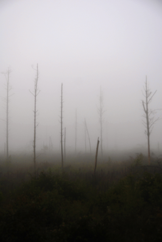
Levels to brighten the sky
Colour balance to bring out the warm tones in the ground
Curves to dramatize it all
& Saturation adjustment to punch the colours up a bit
Statistics
Place: 220 out of 350 Avg (all users): 5.4074 Avg (commenters): 6.6000 Avg (participants): 5.4105 Avg (non-participants): 5.4000 Views since voting: 743 Views during voting: 226 Votes: 135 Comments: 11 Favorites: 1 (view)
Couldn't you pick a title that wouldn't confirm a viewers first impression of this? :-) Yep, it's foggy, soft, nothing to see here... Moving along now... Next!
I'm going through the entries, stopping at those images I feel have had the benefit of an unconventional eye and dwelling a little longer to try to see and appreciate what you saw. This is one of those images.
Positives: I think fog can be quite hard to work with - I find capturing the quality of the light difficult, but you have done that here. I really like the coloration too - it hasn't escaped me that the bottom edge is black and the top is white and how we journey through green and yellow to get there. That subtle colour change guides the eye almost without us noticing.
Critical stuff: Because I like the white at the top, I'm not a fan of the vignetted corners.







 Add photograph to your favorites
 Add photographer to your favorites


 Photographer found comment helpful.


