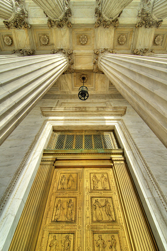
This is another one from the Supreme Court building in Washington, DC.
Editing Details:
1. Tonemapping of a single exposure
2. Shadow highlights adjustment
3. Levels adjustment
4. Curves adjustment
5. Unsharpmask with smaller radius and higher %
6. Resized and sharpened twice
7. Resized and smart-sharpened again
8. Saved for web
Statistics
Place: 1 out of 114 Avg (all users): 6.9144 Avg (commenters): 8.4167 Avg (participants): 6.9556 Avg (non-participants): 6.9014 Views since voting: 4944 Views during voting: 307 Votes: 187 Comments: 35 Favorites: 9 (view)
Greetings from the Critique Club! Don't thing I've ever given a more in-depth critique to a ribbon winner before, but here goes:
Composition and Lighting: Beautiful. You don't offer much for critique here =). My thing would be that the scene seems to be titled slightly to the right. Lighting is about perfect.
Technical: The first thing that catches my technical eye is the discoloration at the top of the door: the two green lens flare-ish looking things. But that would be easily modified in advanced. The distortion at the bottom of the door frame is slightly bothersome, but again this is a nitpick.
Conceptual: The funny thing to me is that even though this is obviously an entrance and won that challenge, it doesn't say entrance conceptually to me - the doors a closed. They don't invite the viewer to enter in. Though the depth of the pillars do.
Overall: As DPC agrees, this is a winning image. Congrats on the blue.
Overall a great perspective and technically solid picture. I personally miss to see more (ore the whole) of the entrance for the sake of the challenge.





 Elegant Entrance
 Add photograph to your favorites
 Add photographer to your favorites

 Photographer found comment helpful.


