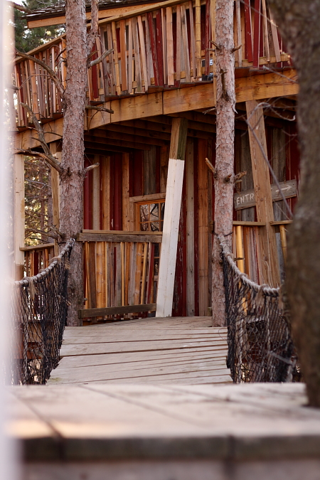
I like the lighting on this. It also shows off good textures and great use of vertical lines throughout with the horizontal lines denoting the bridge.
I think the little entrance sign at the mid right background is cool with the arrow. It would have been good to get more of it in the photo if possible. On the left edge you have an object that should have either been cropped out or ommitted by taking a step or two forward. It's too blurry and takes away from the nice sharp and crisp aspects of this photo. It doesn't do too bad as a frame if that's what you were going after with the entire foreground being OOF. |





 Add photograph to your favorites
 Add photographer to your favorites


 Photographer found comment helpful.


