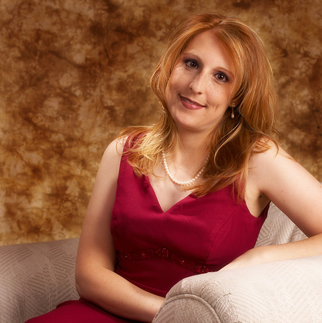
I'm such a procrastinator. I really wanted to enter this challenge, but was busy all week. I waited until 2 hours before the challenge submission deadline on Sunday to ask (beg?) my wife if she'd once again be my "model". She graciously agreed, and put on an old bridesmaid dress she had in the closet, did her make-up and hair, etc... just so I could enter this challenge.
As the submission deadline quickly approached, I didn't have time to do much editing, let alone re-shoot. But I wanted to submit something since my wife went through all the trouble of "getting ready". So I picked a shot, and hit "Submit" with the title as "Untitled", hoping I'd have a few seconds to change it before midnight rolled around. Unfortuantely, I didn't make it, so this picture will forever be in my "Profile" as "Untitled"...
Thanks to everyone for all the great feedback in the comments! I had a feeling folks would recognize her from the previous "Portrait" challenge, and the comments from a few of you show you were confident it was my shot. =]
Statistics
Place: 33 out of 92 Avg (all users): 5.8971 Avg (commenters): 6.4737 Avg (participants): 5.6119 Avg (non-participants): 6.0057 Views since voting: 1509 Views during voting: 416 Votes: 243 Comments: 39 Favorites: 0
Lighting: the eyes have a bit too much shadow, but there are a few small spots that are too bright.
Pose: works, but I would not have cut off her elbow.
Background: too busy. It pulls too much attention from her hair. A shallower DOF would have created more separation I think.
A nearly flawless portrait shot IMHO. The only thing I could see to improve would be a slightly different background. You kind of lose her hair into the background because they are a little too close in color.
TC
A fine portrait and among the best here. Two complaints... the bottom right corner is overexposed, and the background color is too close to that great hair to make the subject stand out. Fix those, and you're in the top 5.
I like what you were trying to do here... make it a very sophisticated shot, but there are a couple of things that I would suggest you go back, and maybe try and shoot again and improve if possible. 1) It looks to me like there is too much light concentrated on her left wrist and the armchairmy eye immediately goes to that spot because of how bright it is. 2) The position of her head seems somewhat off to me, I don't think it looks natural or comfortable, and 3) I feel there is too much extra space on the left side of the picture (to her right). I also think there are too many patterns and too much to look at here... a portrait should focus on her face (classically) and then from there you should find the other things. Nice job with a slightly softer look.
i would change the back color because the color of her hair, maybe a black back color or something dark. And maybe different light to avoid the shadows on her face... good luck
Really great job of matching background to model's hair and skin coloring. Lighting is excellent and red dress gives some added life and a diversion from the other colors.
clipped the elbow a bit too close and the expression seems exhasperated with you for taking so long - but the lighting is good, background and chair work well and compliment her colours - needs maybe a bit more light in to the eye sockets
This model looks an awful lot like EddyG's "Jennifer" so, full marks to you for good taste. Only suggestion here is that the similarity between the background and the hair looses a little possible impact of the great haircolor. The expression on the model is priceless: large amounts of patience and a good nature are what this photo seems to be saying.
Good job. My criticism is hard to explain...but this pretty lady has her chin
sort of tucked in I think because she has tilted it to one side.
Still, nice job the hair and the background match perfectly.
lightint is a bit harsh in some areas but not on the face, the background color is pretty close to her hair color, darker bg would have let the hair stand out a bit more, lipstick and the dress's color seem to match boosting both, on the whole a very good effort
I might have tried a simpler, less busy background, to allow your model to stand out more. Either that,or a differernt coloured BG to get her hair to stand out more. Lighting is pretty good, but there are a few stray shadows on her right side of her face and right arm.
You seem to have the lighting, outfit, backdrop very well planned. The model has lovely coloring which you've captured well with the lighting. She seems a bit nervous---I'd suggest something to loosen her up a bit if she is willing to sit for you again. Some wine, music she likes....something to make her a bit more comfortable with the process.
Background & hair are the same color, makes face appear larger.
Subject looks a bit "stiff", needs a joke to laugh at prior to shutter release to look natural. Good effort, though.
Beautifully lit and tasteful usage of background. Still, the image doesn't really grab me. Maybe with a more dynamic pose? But definitely a good contender.
this would have been so much better with a different background. As it is now, her (beautiful) hair almost dissapears in the background. Plain black would have made it much stronger I think. Try it!
Really a lovely shot. I think a different color backdrop would have made it even more stunning. The backdrop is so similar in color to your model's hair that it takes away from her hair. She has such pretty hair that it would be nice for it to stand out more.
Very professional looking. I think a different chair would have worked nicer with this shot. She is dressed so classy that some type of wood chair would have been nice. The cloth/sofa look seems to take away from her presence. Still an awesome photo...
Eddy, I think a black or darker background would have worked a lot better. As it is it is too similar in colour to your wife's hair and dress, this makes her kinda blend into the background. The lighting looks a bit harsh too.







 Add photograph to your favorites
 Add photographer to your favorites


 Photographer found comment helpful.


