from the Critique Club:
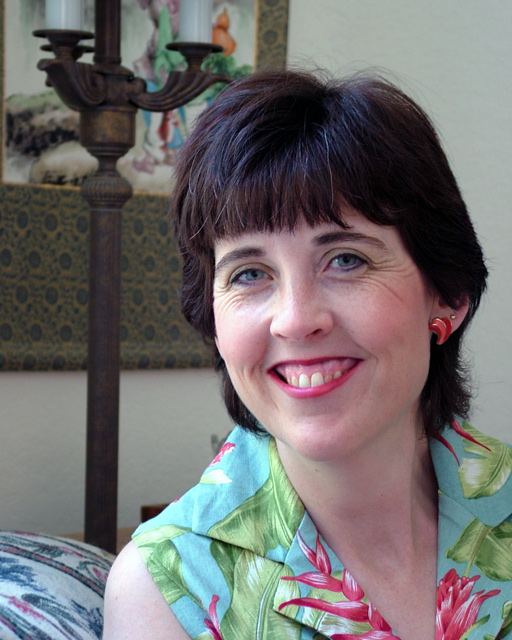
This is a very pleasant casual portrait. The colors all blend together, like the red from the lips, the red in the blouse, the red on the sofa or chair and the red in the picture.
However, if this were a formal portrait the eyes would not be so busy in observing the color scheme. One of the objects of a portrait is to concentrate on the face. You can show more than the face, but the ultimate detail must be expended in the face. So the first thing we do is use a plain wall such as that behind the subject. Now the subject gets all the attention with no competing objects to distract. The old masters always focused on the eyes, their liquid quality should be brought out.
Let us make this a better portrait. We need the same wall and, of course, you have light from one direction so you will have to find the right wall and sit Tess away from the wall. I would even close the aperture to 5.6 so as to increase the shutter speed. Now, we take any lamp in the house and remove the cover so as to expose the plain bulb. Turn it on and find a placement behind you or near you. The eyes will pick up the highlights. Now Tess has beautiful complexion and charming eyes. We will ask tess to release the smile, wet her lips and then gently begin to curl them. The current smile is real, but it is making her eye lids contract too much. We need the lower eye lids more relaxed. We are going for a half smile. Stop at the moment that the upper lip begins to thin. At this point the facial muscles will be half what they are, yielding a more relaxed pose and we will see the full shape of the bottom of the pupils. Every little bit helps. Shift the angle of the camera just enough to eliminate her right ear from view.
A word about selections and using GB. It is dangerous to blur a background from a portrait. Even tools such as extract fall short. I do a lot of selections and it takes me valuable time to perfect it. There is no magic automatic tool. It takes a few seconds to select and at least a half to a couple of hours to make corrections. Given the choice, simplify the background before the shoot. If you look at Tess on the left you will notice the feather blur next to her hair and unto the frame. While expert PS operators use GB to recompose their dof, you need to work on at least actual pixel size. It is best to give dof a good thought than relying on PS. Outside of this critical application GB has many uses. Yes, the 5.6 aperture will increase the dof, but since the wall is plain, a couple of feet will prove no problem.
Again, your photo as is is very pleasing and can hold its own as a very good casual portrait. Reconsider, keep this current nice image but but give yourself the challenge of a redo. I know Tess is happy with this effort, she will be happier with the next. dan
This is a very lovely shot but the cropping could have been tighter on the left to take out the lamp, it's a distraction in the end. Also the print on the wall could be removed, giving you the solid background and then you could have cropped closer in on her face. Nice expression, good lighting. Started with a 4 but going to a 6
Lighting: Lighting is well balanced, but the lack of a catchlight leaves the right eye looking flat.
Pose: The pose is fine, but the extreme smile has caused some unflattering lines.
Background: Is a bit cluttered, but not overly so.
Another nearly flawless techincal shot. You obviously used natural light which is a nice touch that hardly anyone used. The only complaint I have is the colors seem just a touch dull.
TC
Background is a little busy, as she needed just a bit more space. Or cropping tightly on her makes this great, as she helped with the perfect expression.
Good lighting and expression on the model's face. I would have preferred to see it without the lamp and pillow/furniture in the background. Good effort. :o)
I wish the background were a bit more blurred with a shallower DOF so as not to be so distracting. Also, the lamp pole seems to be coming out of your subjects head and I wish that it were parallel with the side of the frame, and not converging. Good lighting and color.
Lovely lady. The background is very distracting. Maybe sit her farther away from to get more blur. The lighting is good. Maybe a bit harsh on the left side of her face, but not bad.
The background is extremely distracting. I would suggest using shallow depth of field when you can't place your subject in front of a simple background.
You have a nice natrual lihgt but i find the background a bit to crowded. It is to distracting, especially since the modell has a rather colourfull blouse too. I think a more natrual background would do wonderf here.







 Add photograph to your favorites
 Add photographer to your favorites

 Photographer found comment helpful.


