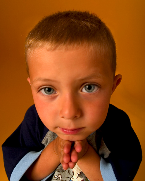
What a cute face! Reminds me of those dogs with the really big heads? And that is cute for the dogs but I don't really like that look too much myself. His hands look so tiny, it's really a bit distracting to me. Also the orange/flesh colored backdrop offer no contrast to him or his skin. He almost blends in around the edges. A 5
Really cute picture. It looks like the focus is sharp on his shirt but soft on his face, so you might want to either reverse that or just go all soft for the portrait. I'd say go with more depth of focus, but I know how hard it is to keep a child still for long enough to take that shot. :-) Very nice shot.
Lighting: The lighting is well balanced with an expressive catchlight, but the color cast is a bit much.
Pose: "Please give my mommy a good score!". :)
Background: Does not complement the subject.
The caricature-like angle on this shot really makes it stand out from the crowd. Good choice of background color, too. The expression could be better, but the soft focus on the eyes is the only real weak spot here.
I love this picture! Like the one entitled "Veronique" the lense gives a interesting perspective and angle which creates some real personality! I love his eyes, and how they have become the focus of the picture. OH, but I wish they were in focus!!! I also wish the light wasnt so yellow. Please try this shot again after the challenge - it is a real treasure! 6
How cute! Look at those eyes. I bet he gets away with alot of stuff. hehe....
Critique: I like the wide angle use. I would try using a background that doesnt blend with his skin and have him wear a shirt with no charactors. Nice lighting, but try setting your white balance to indoors, it seems to have a yellow/orangy tint.
With all my attention drawn to those eyes, I think they really need to be in crisp focus. The focus on his his t-shirt, which is sharp enough to see the texture of the fabric, I think could be sacrificed for the trade.
The wide angle perespective reminds me of the Margaret Keane paintings. Colors are good but looks like tungsten lighting. Focus on the eyes is not quite there.
Love the WA distortion here, his expression is great, everything but the fact that his eyes are out of focus and his shirt is in. That really kills the whole shot for me. It would have been a straight up 10 otherwise.
this is the cutest picture of the week (well, equal par with the sausage dog). i'm normally a bit anti kids (and not just in photos) but this chap is hilarious. fantastic pose, love his expression, it's been taken from a very fantastic angle, has the appearance of studioness (so fits the challenge 100%), but if only it was a smidgeon sharper. but still, has tonnes of character, and anything that makes me laugh should do well... 8.
I lke the colors. The DOF needs to be increased a bit to bring the front eye into more focus. Being more on the childs level will keep from giving the larer top area compared to botom. Looks a bit out of proportion.
I love the colors in this photo. I would have kept the eyes sharper than the rest of the face since they stick out like they do. Overall great job, 10!
Wow, what a forehead... Cute kid! Great color scheme. From what little I know about portaiture, you used a 50mm or shorter lens and were too high in perspective to the child hence the never ending forehead...
TC





 Add photograph to your favorites
 Add photographer to your favorites


 Photographer found comment helpful.


