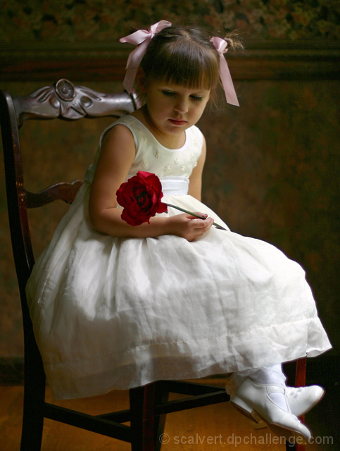
This whole process was a comedy of errors. I waited too long, so the late sun didn't provide enough light for this window-only shot. I used a 50mm f/1.8 lens wide open, but had to employ negative exposure bias to keep the dress from getting blown out. After the kids were asleep, I remembered my fancy flash and diffuser (DOH!). The resulting photo was way too dark and took an enormous amount of levels and dodging and burning to rescue (I could have shot in RAW, but noooo...).
I was trying to get my daughter to look at me and smile- can't you tell? My wallpapered dining room backdrop wasn't quite tall enough, so I had to clone a bit above the head. Other post-processing: USM, crop and slight rotate, increased saturation, and just a touch of the sepia Photo Filter to warm up the white balance. I carefully desaturated everything but the ribbons, lips and rose (but not completely to grayscale), to get a very cool, vintage effect. Then I read the challenge description again (COLOR Studio Portrait). Start over.
In the end, I think this shot came out quite nice (I still like the vintage version better). I hope I'm not the only one who likes it!
Statistics
Place: 7 out of 92 Avg (all users): 7.0451 Avg (commenters): 8.2368 Avg (participants): 6.8000 Avg (non-participants): 7.1341 Views since voting: 4076 Views during voting: 416 Votes: 244 Comments: 50 Favorites: 10 (view)
I enjoy your story about this shot. Wonderful picture. I gave it a 10 and will give you more than that after reading the photographer's comment.
What i like most about this shot is the fact that she was not looking at you.She looks more innocent, shy and delicate. That expression goes well with your subdued lighting. Congratulations. You should place higher than me.
Lighting: Good light from the right, but needs more from the left to balance and get rid of the dark shadows (particularly in the eyes and rose. The eyes are too dark without a catchlight.
Pose: Very cute pose, but she is leaning a bit too far forward for it to work I think. Cropping the chair just slightly forms lines that draw the eye out of the scene. In fact, I think it would be better with a much closer crop from all sides except the top.
Background: The background is distracting, particularly the molding running through her head.
AT first I thought that this was a high key approach to portraiture, but the more I look, the more I love the warm tones. The rose and her look at it is key here! Nice job!
TC
Charming! Expert lighting and wonderful expression! To be critical, the pigtail on the right is unfortunately sharp and contrasty--spot editing might help diminish its intrusion to the composition.
I think this is a great photograph. OK let's play guess the camera...it seems to have that Canon 10D look to it, but I don't much about cameras or how to get a picture like this. It's really really nice though.
Beautiful image. I love the almost-Victorian or maybe Italian renaissance feel of this photo. Lighting is excellent, focus and colors are good. Nice job! :o)
I love this vey classic looking picture! Your little model is beautiful and meticulously made up. The chair and background give an antique look to the picture without being distracting, and I love the girl's gaze at the rose. Lighting is very good, but I think that a spot on the flower could bring out more detail and maybe a little less light on the floor. Other than that I love it. High mark.
You nailed it! This is what a good portrait should look like. The lighting is beautiful, flattering, and it doesn't look "staged" like some lighting set ups do. Her expression is wonderful and thoughtful. A solid 10!
Another beautiful shot, this girl will treasure this when she's older! Hang it over the mantle. Lighting is beautiful, the rose adds a touch of vibrant color. I love it.
this is great! I havent seen a shot like this in a while- i like the "old" feel..and the innocence of the girl.... good choice of clothing also. Maybe too tight of a crop?
Reminds me of old-time oil painting; loss of a little highlight detail on the edge of the dress (at least on my monitor) is my only "complaint." I think it could have been even a little darker while maintaining the mood and detail. I think this was a good time to use a less-common full-figure portrait.
My main complaint on this portrait is that she looks like she's slouching. And I'd prefer red hair ribbons to pink to match the rose. I've never thought pink and red look nice together.
Beautiful light. One of my higher rated photos. Nice job.
Beautiful soft lighting! Adorable model! Probably one of my top three
The only thing I would change would be having her sit back a little more. It looks like she is slouching a little. Still, very well done! 9
Very, very lovely. Your picture is my pick for a ribbon! I think if the ribbons in her hair and the rose were the same color it would make this portrait even more stunning.
Too much make-up on the girl--not very subtle. The ribbons and the rose overwhelm her a bit. The rose is almost as big as her face. Next time, I suggest less fussy hair and make-up and a softer colored, smaller flowers more appropriate to the age and innocence of the child.
Beautiful photo. Only thing I would change is just a teeny lil bit of light on the left, maybe from a reflector to just bring out a lil bit of the shadows. 9
This is a beautiful, timeless photograph! Wonderful job. My only complaint is that her face is so shadowed. I like the bright side light, but a soft glow on her face would have made it perfect.






 Add photograph to your favorites
 Add photographer to your favorites

 Photographer found comment helpful.


