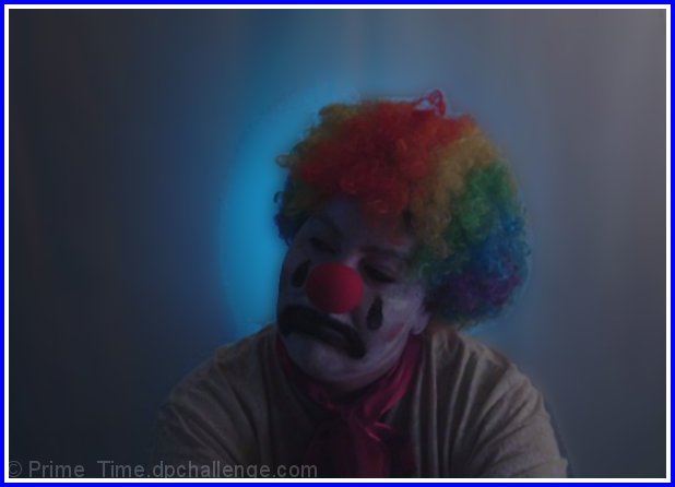
Took at night. Took a sheet and hug it behind the subject, Used a desk lamp with blue light. Only other light used was 75 watt bulb. My cam does not do dark shots well for me, was a challenge.
Statistics
Place: 86 out of 92 Avg (all users): 4.2678 Avg (commenters): 4.4848 Avg (participants): 4.0303 Avg (non-participants): 4.3584 Views since voting: 1106 Views during voting: 397 Votes: 239 Comments: 36 Favorites: 0
Thank you, everyone for the comments. I know that I would have done better, if I had used more light. But it was taking away from the from the back ground. Was not going to use this one anyways we were tired and my subject was sleppy (my wife). For those who thought she was he lmao.
Lighting: Even though the tone of this portrait is dark and moody, the backlight is working very well to give a solid separation. I realize the mood was desired, but I think it went too far. The eyes are by far too dark and very little distinction in the paint around the mouth.
Pose: Well suited for the desired effect, although I am sure you will get counted off for the landscape crop.
Background: Works well for the intended mood.
Wonderful concept, and a great set up , a little dark, the colors are perfect. and I like the halo effect in the background, this would have been a phenominal shot if it had been a little brighter. I would definitely consider doing this again if I were you, (in another challenge) a little brighter an you would have a winner! 7
I like the feeling that you achieved here with the (painted) facial expression and the blue background and soft lighting. I do believe though that it is a little TOO dark and could benefit from cropping a tad bit off the right. The white part of your border is distracting and too high key for the rest of the shot.
TC
Send in the light while you're at it. A very good concept, but wasted by poor lighting, and I don't feel like there's enough contrast between dark and light tones to pass as moody. The bright colors could have made a dazzling entry with more light in the room. The obvious artifacts around the hair and arms don't help, either.
This would be a really nice portrait or even a poster if it were cropped a bit more on the right and the lighting were a touch brighter, so we could see more detail of the sad expression. :o)
well, it's certainly got color. :) I bet you're getting a lot of comments about how the lighting is too dark. It's true, actualy, but it gives the photo a bit of a painterly feel.
It's a pleasant prrtrait but seems rather sad - especially for a clown. Border is not good and detracts a lot. I'd like more lighting on the face and not the background.
I like this version of a clown picture (the sad clown), but I think the picture is too dark on the whole. Could have used a spot for his hair and face to brighten things up.
I love the idea of this one. I think that it could benefit from a bit more light and contrast. Understandable it seems to help the dreary look on his face, but maybe a bit more vibrancy in the colors (especially the "hair") may have made this stand out more.
This has the potential to be a really great portrait with the right lighting and focus. I think you are going for a blue/sad mood here and while the lighting helps with that, the lack of focus and light hurts it more than helps the mood of the shot. As is a 3
Nice idea. Subject is too indistinct and under lit. Image is fuzzy and soft with what looks like some rather rough editing. Subject offset further to right would emphasis the loneliness/sadness.
The lighting is way too dark. You can barely see the subject's face. You need a spotlight somewhere near the clowns face to make a strong statement about theater, etc. The clown make-up looks amateurish (the white is very streaky looking)





 Add photograph to your favorites
 Add photographer to your favorites


 Photographer found comment helpful.


