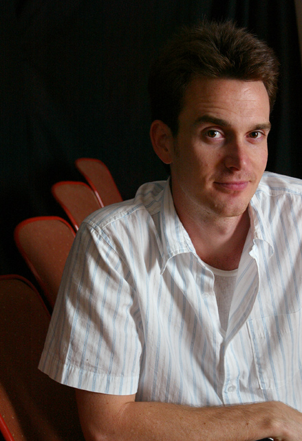
Lighting: The ligting works well, although a small light behind the head would have provided some needed separation.
Pose: The pose is a good one, but the hunch in his shoulders and the open shirt change lay of the clothing to form leading lines pulling the eye away from his face. Cropping his left arm off would not have been my first choice.
Background: The black is done well, with the chairs balancing the composition, but I would have liked to have seen more separation between his hair and the background.
Wonderful shot, the lighting is great not too harsh, if I could say anything in the way of a critque it would be the shoulder needed IMO to be in the shot, and the hair is such a warm dark color it blends in with the background a little too much, the facial expression is wonderful, great facial tones.Over all a good shot. 7
Technically excellent and a good expression. This is one of those "just doesn't speak to me shots," but I can't put my finger on the reason. I think if the background were more interesting, it might give the image better context. Still a very good portrait.
Something about the the crop/composition/orientation creates a sort of tension I don't like in this shot. It has something to do with him facing to the right, but having that side cut off. Other than that, well done.
I really like this portrait...the setting is great. The pose appears natural, and I like the "smirk" kind of grin rather than a posed smile. Well done. :o)
Nice lighting - great exposure. With this pose and lighting, I think the composition would be better if the lit side of the face were not on the edge of the image. The small piece of the chair showing in the bottom left corner is detracting.
His hair in the back of his head almost matches the background. You can see the color differences in his hair and the background but maybe if there were more seperation between the two then this would of been a great shot.
Very strange crop. He really should be leaning into the shot rather than out of it in my opinion. Bu what the hell do I know I'm sitting at 4.9 at the moment!
The background chairs are a little distracting, but not too bad. Eyes are in focus, nice expression ... good job. Not sure about the crop at the hand, but I'm also not sure how to make it better.
It looks like there are three chairs bonded to his shoulder. If the lighting was a bit better on the chair he is sitting on it would connect the row of chairs and look less like the other ones are growing from his shoulder. Overall, it's a nice portrait.





 Add photograph to your favorites
 Add photographer to your favorites


 Photographer found comment helpful.


