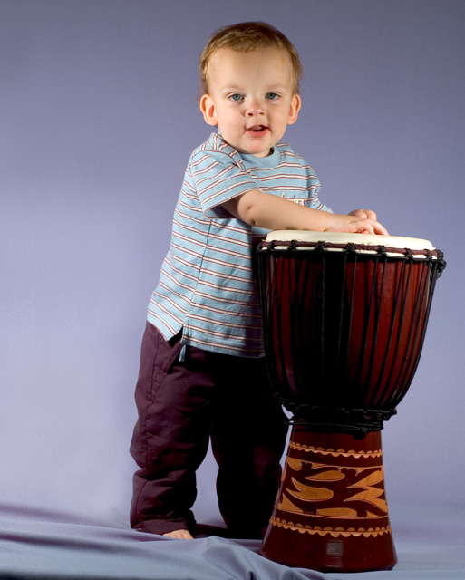
Lighting: The lighting is good, but I would prefer a catchlight to accent his eyes.
Pose: works well, but the expression could change. (where are his shoes?)
Background: works well.
Nearly flawlessly executed if not so inspiring portrait. Somehow it looks a little TOO contrived or posed. A more natural pose would help bring life to the shot and bring out a beautiful boys personality!
TC
I'm sure you've probably heard this quite a few times by now, but I would have liked to have seen this image straightened. Other than that, an outstansding entry. Also... don't apologize for your entry in your title... the voters tend not to like it.
Pretty good first try ... I like the colors and the lighting is pretty good in the important parts. I think I'd try a small counter-clockwise rotation to level the drumhead (the point of maximum contrast; it attracts the eye), but not so much as to get his eyes too out of level --the drumt is a good prop for this shot.
Not bad for a first attempt! :o) Lighting is effective and focus/detail are good. Would like a bit more sharpness in the eyes. Floor is a tad distracting due to the bunching up around his feet and the base of the drum. Good effort. :o)
That's good that you're trying something for the first time. I don't know if you need to tell voters that or not, it seems like you're trying to get better votes from sympathy that it is you first attempt. But it is well done nevertheles. Would like to see more of the bottom cropped off, wrinkles in the sheet are a bit annoying.
Hey, cute kid! Blue shirt on blue background doesn't really help bring out the main subject (the boy). Perhaps a darker background might help. The wrinkled floor is distracting. Also, the boy and the drum are tilting to the right... needs to be straightened. The drum is an unique and excellent prop! All in all, a very good portrait.
Great first attempt...
A couple of thoughts for possible improvements:
o The background is very light right behind the subject. This highlight area is a little distracting because it draws attention away from the subject.
o It appears that there is light from both sides and a slight shadow down the middle of his face. I'm not sure why, but this seems to keep the facing from drawing the attention it needs. Maybe play with the fill light.
Hi Karson - you have a very talented mom or pop! Nice exposure, composition and prop. Frame it and give it to him when he graduates from (fill in the blank.)
Compositionally unbalanced - I don't see the benefit of all that negative space image left ... just looks like a mistake; especially whne it places your main subject on the terribly weak central plane of the image. The weight of this composition is more about the djembe than about the child. That said, the light is pretty good (though his head seems under-lit compared with his body, slightly), and there's texture to the clothes; the pose is awkward, and the expression a touch bizarre for a really happy formal portrait. 5
Very good indeed for a first attempt - maybe straightening the tilt would improve, as would a smoother back drop at his feet but that would have been difficult to achiveve.
A little hot on the right side of his face and too dark in some spots, but generally good contrast. Good pose and good job eliminating background shadows. Very good first portrait
the whole shot looks crooked, he doesn't have a very natural pose, and your cloth on the bottom is all wrinkled. Please don't take this too negatively- this challenge is my first portrait too, and it isn't very good either.
It;s a good portrait, nothing fancy, nothing special, just nice for friends and family, just as you would expect to turn out if you would go to a studio photographer.
So good Challenge entry.
awesome ... although if you shot from just slightly above hid eye level, it would have forced him to open his eyes a bit more in order to look into the lens ... it's great as is though.
very good, esp. for a first attempt. Brilliant move to emphasis his small size by putting him next to the jembe. As I noticed in other child pictures, a light blue/lilac background often makes little children look a bit pale. I think either white or some stronger color would be better. Apart from that it is beautiful.
Congratulatiosn on your first attempt. :) DId great in my mind. Thelight is even, natryal and soft. Contrast is really good and you have a good view point for a childs potriat. Nice compo too.
Very nice. I like the lighting, color, and focus. The drum was an excellent idea for this little guy. The only thing I don't like is the tilted perspective.
Nice, but it may need some better lighting between his pants and the drum. Also maybe if there was a little more saturation to the photo would help a bit.






 Add photograph to your favorites
 Add photographer to your favorites


 Photographer found comment helpful.


