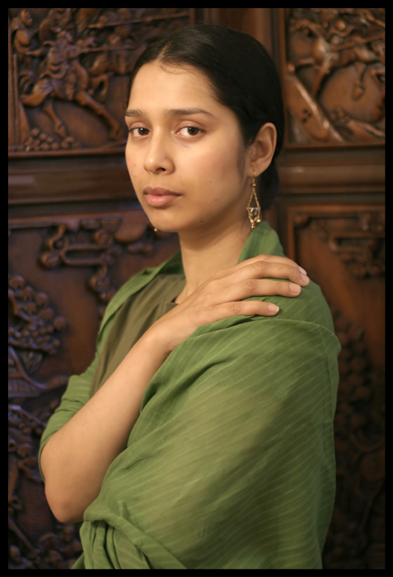
pretty much straight out 'o the cam. Did a quick crop. a bit of cloning & healing to take away some unseemly bright spots, bit of neat image to ditch the noise & ge the max quality possible for the 640 resize. Oh yeah, the model is my sister. Pretty, huh?
Statistics
Place: 21 out of 92 Avg (all users): 6.2634 Avg (commenters): 7.2333 Avg (participants): 5.9104 Avg (non-participants): 6.3977 Views since voting: 2052 Views during voting: 416 Votes: 243 Comments: 34 Favorites: 4 (view)
From the Critique Club:
This is a beautiful soft image. The choice of colors is soothing. The olive green and inner garment weaves a wonderful image and of course, the background adds the exotic tinge. The hand placement is to be commended and the model, your sister, very natural. You did a good job but we owe her credit because her facial expression displays a sense of serenity and a unique quiet confidence.
The study has some minor imperfections and believe me, they are minor compared with the overall strong visual effect. Let us start with the cropping. Note the bottom of her left elbow. Here we have material folding in and out and when the eye moves from her lovely face it finds this distraction at the elbow. It would have served your purpose better to crop the image right above the right elbow. The benefit is to have brought the rest of the figure closer to the viewer. The second item is that of the right earring portruding or jutting out of the chin. here you had the choice to raise the angle a bit or simply to clone it out.
The third item is not as critical and this has to do with the eyes. I take the eyes as they are, but their beauty is not displayed. This happens when an image is soft, yet many photographers magnify the eyes and touch up the highlights very subtly a pixel at a time with pure white with a 40 percent or so opacity.
A good image and certainly a good contender. You can only get better. dan
Hey rooster! I really like this photo although I'm not a fan of neat image, it's barely noticeable. I like the use of her hands in the photo, creates so much more character. And yea, she's very pretty :-) Good choice of color [wardrobe] and background. It's interesting without overpowering her ;-)
Lighting: Nicely done, but with eyes that dark I would have liked to see more of a catchlight.
Pose: nice.
Background: works, but is a bit distracting. Using a shallower DOF would have worked better I think.
Very nice job. Lighting, focus, pose, composition are all spot on! The only thing that takes this from a great portrait to a nice portrait is the background. IMHO it is a little busy. A shallower DOF or more subdued lighting on the background would take this into the realm of great portrait!
TC
Beautiful portrait with good pose and expression. Skin tones and color are very good and natural looking. Perhaps a bit more blur to the background would have been better as it's somewhat distracting and the relief on the furniture of the horsemen have their spears aimed at her head! lol Excellent work, nonetheless.
A beautiful portrait, I would normally say maybe blur the background a little more.
but it doesn't need it as it blends brilliantly.
good luck..hope my 10 points helps.
I love your choice of background - adds charcter and texture without being too distracting. I like the colors also - the dark wood, her golden skin, and the earthy green of the shawl. The pose is very relaxes and contemplative. My only complaint would be that the lighting is too flat - I like how it is soft on her face, but I'd like to see some contrast with the background -
A truly beautiful study. Soft all through out with great colors. I would have gone a a tad higher to avoid the other earring showing or would have cloned it out. It still remains one of my favorites.
A little sharper focus on the eyes and a little less depth of field would have made this much stronger competition entry given the competition. As a general portrait, I like this alot, and think that the background and dress color work really well together.
I love the earth tones. It compliments her skin tone very well. Some PS work on her eyes might have helped make this pop a little more. Just a suggestion.
very nice portrait, your background is more interesting than the plain ones but nicely blurred so it isn't dominating, the color of her dress and her skintones compliment each other; since this is an advanced rules challenge I think you would have improved it by cloneing out her right earring where it shows beneath her chin, that's a distradtion at an important place in the pic
Absolute superb lighting on a very special model. I know it's minor - but her right ear ring looks like a facial mole - which is bothersome. I normally am not a fan of borders - but this one does not draw any attention from the image = ok.
Very beautiful. I think if you had cloned out the earring just visible on her right side it would have taken away a distraction. I had to study the picture for a while to figure out what it was, at first I thought perhaps she had her chin pierced on the side or something. If the background were a bit more blurred it would also put more emphasis on the person.
Nice portrait but I find the background a little busy. I'm sure you model has some beautiful Sari's but the one she is wearing is a little dull in colour too. Perhaps a brighter coloured Sari would help stop me looking at the background carvings.






 Add photograph to your favorites
 Add photographer to your favorites

 Photographer found comment helpful.


