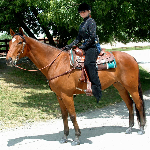
This is Sam and Sammy at the 4-H County horse show. They took Grand Champion on Saturday for the English Saddle part and this was taken on Sunday for the Western Saddle part.
Cropped, cloned out person in the background and the cars, cloned in his hoof on the bottom front and the shadow of his face as they got cut off. This was a one shot deal, didn't get a second chance.
Adjusted brightness -15, upped contrast +8, ran the unsharp mask and there you have it.
I fully expect this to get a lot of "Does NOT meet the challenge" because it's not an inside studio and not your traditional shot but I don't care. I couldn't use Melissa for a studio shot, you all know her too well and Sam asked me to take this for her as a favor. I'm very happy with the way it came out and am proud to call it one of mine. Besides, tell me where I'm going to put a horse inside my house, LOL! :)
Statistics
Place: 89 out of 92 Avg (all users): 3.9167 Avg (commenters): 3.4400 Avg (participants): 3.2500 Avg (non-participants): 4.1802 Views since voting: 1349 Views during voting: 380 Votes: 240 Comments: 28 Favorites: 0
Lighting: The natural light is nice, but the heavy shadows, especially across the eyes detracts greatly from the photo. The shadows and the lack of a catchlight hide the expressiveness of the eyes.
Pose: The rider and horse are both posed well, but the image needed to be rotated clockwise a bit. As it is they look as if they are about to pitch forward.
Background: The background does not appear to have been planned for a studio portrait, ranging from too dark to decern detail and very hot bright areas.
This is a good outdoor portrait, and captures a bit of your subject very well. Only thing I can think to recomend is that you use a little less DOF to reduce emphasis on the background.
This really isn't what comes to mind when considering a "studio portrait" IMHO. It is a good picture of the young lady and the horse, however some of the highlights are a bit blown out. The shadow cast on her face from the hat is a bit distracting as well. :o)
Doesn't really look like a studio, more of a candid. But it is still a portait. It is outdoor lighting so the exposure is uneven. But I like that shows her doing what she likes. Usaually portraits focus on the eyes. So her face sees too close to the border for my liking. But both creatures in this shot are beautiful.
I'm sure this is getting hammered for being an outside shot, I don't really care about that. You captured a great expression on the rider. I think this would have been better if this were shot early morning or late afternoon when the light is warmer and less overhead.
Beautiful horse and lovely girl! However, this shot has a few issues that are easy to overcome as a photographer. The first one is the harsh lighting. If this wast taken during a different time of day that would help to do away with the too strang highlights and rather dark shadows. Or you could move horse rider and photographer to a more shaded area and shoot there. The girls face is hidden a little in a shadow. If you use the flash (yes, I know it was daylight out) it would help to fill in her face with light. The shot is slightly tilted which is easy to fix in photoshop.
This is probably getting slaughtered for not being in a studio. I'm having the same problem there even though mine is kind of ambiguous in setting I thought.
Your outside. Challenge clearly sated that you had to be indoors. Also, the tree's sahdow fooled your camera and the shot is slightly overexposed.
The angle used to shoot your subject is too perpendicular to your subjects. A suggestion if you would like to shoot this again: use a low angle shot (shoot from on your knees, looking up) in front of the horse and just capture the horse's head , bridal (sp?), part of te reins and the rider from waist up. Another idea would have been a waist-up shot of the rider standing on the ground with both horse and rider looking (or not) at the camera. Both these shots would permit you to get closer to your subjects and put more emphasis on facial features.
A girl and her horse ... what a wonderful concept ... illustrating the bond between her and her horse! I see portraiture more as a photograph or painting showing the face rather than the whole profile and taken in a more studio-like environment. Perhaps a close up of her standing near her horse while petting the horse's face or neck ... I think that would illustrate the special bond between the two more, and also would fit the portraiture challenge.
While this would look nice on the mantle or in a family album, it's not a great studio portrait. The bright daylight washes out areas of the image, while her blak hat disappears into the dark foliage behind her. The focus is sharpest on the horse rather than the girl, where it should be the opposite. There are many areas where dark colors slide into black and light colors into white, making the image look flat. Her eyes are shaded by her hat as well. If you could have reflected some light on the girl from just above her in front, the image would have looked nicer, but it doesn't really fit this challenge anyway.
you will get this a lot, but this doesn't meet the challenge at all. No studio, no special lighting and although it's a nice horse and a nice girl, the picture is nothing special.







 Add photograph to your favorites
 Add photographer to your favorites


 Photographer found comment helpful.


