First Impression: I got the idea you were trying to portray but there were a few things that could have been improved.
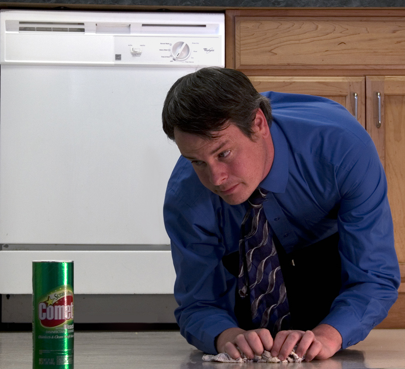
Composition: The very top of the picture has the background above the counter, actually I think it's the counter edge. Cropping just a little bit higher or lower and straightening the picture to include the counter as a small border at the top or to eliminate it completely would have been better than having a sliver of it diagonally. It's not super noticeable though so not a big detraction. Oh and one other thing would be to include a little more space at the very bottom. As it is now the Comet can is cut off.
Subject: Subject and message is good. I would have liked to see the man and Comet a little brighter with the dishwasher in the back a little darker. I like that the dishwasher is in it, gives you a location rather than just any random floor.
Final thoughts: My goal in every challenge is to beat my average and you succeeded in that, and congratulations on your picture making it into your top 5 highest rated on your profile. Good luck in future challenges!
The light on his face looks very dull. The dishwasher is also the brightest thing in the photo when it should be the Comet. Adding a rim light to the Comet might make it stand out better, but I would also put a little more light on the front. This is a good idea, but I think it would have been better received with some better lighting.
LOL! Not sure what the message is, really, but love the shot. The look is priceless - and those SO not used to scrubbing pristine pink hands... My only suggestion is you need to have the product in very crisp focus for most of the ad folks. (Commenting only.)





 Add photograph to your favorites
 Add photographer to your favorites

 Photographer found comment helpful.


