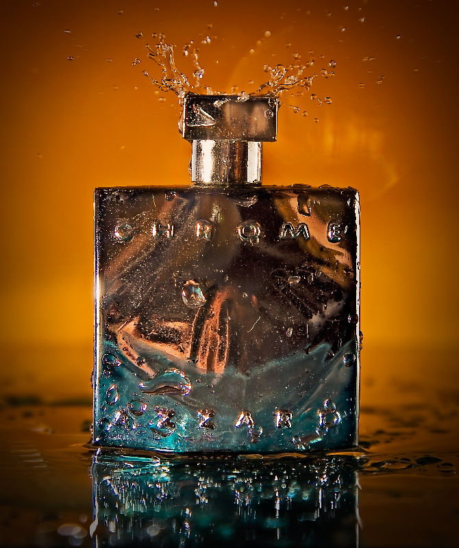
Love this photo! I think it would fit perfectly in a high fashion magazine. The sharpness of the bottle and of the water could not be better! The color contrast works well in this image because it helps to make the perfume bottle stand out even more. Very nice!
Excellent lighting and clarity, great colours, nice. My only nitpick is that I find the text on the bottle a bit hard to read. I suppose that's because of the design of the bottle, but maybe because of the lighting as well? Hard to say. Still in my top 10.
Great lighting. The drop on the top is good. The warm lighting on the background is great.
I see some glare on the right top just above the bottle. And also the product itself has a lot of distraction on the surface that makes the text look distorted.
Really love the abstractish-ness of this even though it is delightfully clear. The surface of the container is a wonderful reflective surface. Hard to read the product itself but its good enough once you look. Nice use of the splash off the top! Only slight nit is the reflection on the background. Were this a true ad, that could be cleaned up with cloning or healing. (Commenting only.)





 Add photograph to your favorites
 Add photographer to your favorites

 Photographer found comment helpful.


