From the critique club:
A portrait is a study of character in a visual form. Photographic technique is carefully examined even by the neophyte. This is because we all communicate with people daily and we can not help at times, to study their facial expressions. We are sometimes moved by how the light plays upon the facial features and the hair. Of course, the human eye, being more sensitive than a camera is able to capture more detail.
Your self portrait exudes a warm candor, so warm, in fact, that its minor technical oversights are almost made so unimportant that they fall by the wayside. To do a self portrait of this caliber is indeed a remarkable feat and it speaks of your inherent talent. So, let us proceed with the assumption that this is a great self portrait.
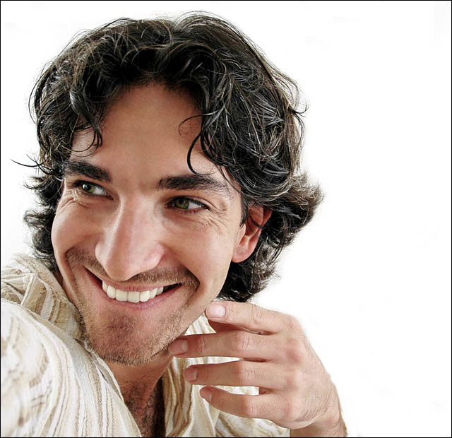
However, let us make believe that you were photographing the subject from the viewpoint of the camera and make this a perfect 10. The chosen light scheme required another fill light in the front. You know about the inverse law of the intensity of light. Two lights of same value, placed at identical distance yield 100 percent. Move one light back half the distance of the other and this light is now 25 percent effective. Well, the frontal fill light of same value could have been placed just over a full distance and this would have aided the detail in the left eye of the subject and reduced the 2nd zone at the crease of the smiling cheek line and gave a hint more detail in the hair line. This would have retained the identical character of the lighting and the only drawback would have been a slight reduction in the definition of the dimple.
The composition is strong and the offset placement fit the image like a glove. You also managed to maintain a consistent coloration between face and hands. The highlights are a bit subdued, but the study remains very strong regardless. There are two distinct schools, those that love and those that hate the well defined highlights. One group says, highlights are too formal and stiff for candid and modern portraits. The other group uses them much like the artist that sketch faces or to add shape and form.
In looking over your portrait, I accept it as is. You achieved almost the impossible because you put forward such a wonderful and natural pose just like when an expert photographer elicits the best from its subject. Great job.
WOW, what a winner, and it a guy !.... I REALLY like nice women portrait and nude... but this shot is one of the best OVERALL.....little girl, baby, dogs and cat.... bye bye here is the men portrait wave taking over you !
WOW, what a winner, and it a guy !.... I REALLY like nice women portrait and nude... but this shot is one of the best OVERALL.....little girl, baby, dogs and cat.... bye bye here is the men portrait wave taking over you !
way to go bro. I knew you would get a ribbon soon. Now if I can find the time to get back into this it would be nice. Congrats, and I am sure there are more to come.
There you are! You are your favorite model, aren't you? :)
The background is almost overpowering in this shot. Too white, it almost hurts my eyes to look at it too long. The lighting seems a bit harsh on the right, causing some shadows on the left side of your face right under your eye, yet I can see where light is coming in from the left as well. The eyes have a nice smile factor to them but the lighting in them also seems off balance, the left eye has a nice sparkle while the right eye seems shadowed. A 6
Lighting: The softbox is really working well for you, although I would have liked to see more light in the left eye.
Pose: You have as much fun in front of the camera as you do behind it, and it shows.
Background: The white works well.
Given the subject's apparent interaction with someone off-camera, it seems odd to have al the negative space off in the other direction -- I'm expecting to see other people lined up at the bar or something. I think you could crop all that off into a standard vertical aspect ratio without compromising your theme at all. Lighting, exposure, focus, expression are all great.
A little high-key, and I'm not generally a fan of subjects leading the viewer out of the frame. Oh... who am I kidding? My second-favorite of the bunch! Looks like you may finally get a ribbon Mehmet. Judging by your expression here, you already knew that, didn't you? Congrats!
Well, how can you go wrong with a face like that? Technically very goosd with the lighting and focus.I like your choice of the white background and the textured white shirt - the dark hair and eyes really pop out at you as a result. The expression on the face and the gesture of the hand are very telling and natural, combined with the composition that places the subject at the left side off the frame looking out - all this creates a story that goes beyond the individual. There is a lot of personality, but the viewer is left wondering "what or who is he looking at?" Well done! A favorite of mine. 9
Good lighting and technically a sound shot although the composition is a little awkward on the eye. I do feel that this is quite a shallow portrait though, in that you look very conscious of the fact you're taking a picture of yourself, but are pretending this is candid.
If it was not so obvious that your arm was holding the camera (or seeming to be) this would work much better, since your expression suggests some off-screen interaction, yet you're clicking the shutter and the two things don't fit.
Another self portrait. My, my. Aren't we a bit narcissistic? Just kidding... Love this shot. By far one of the best. Great high key image. One of, if not the only one, where I find the hand actually has its place in the shot. It shows that you have been playing with the portrait format before and are comfortable with it. I'll be very surprised if it doesn't ribbon.
I really like this shot, the lighting is perfect, negative space is great, the different tones captured in the skin are great, I imagine a blue ribbon coming your way soon :-) Well done, a perfect portrait shot to be proud of!
My favorite. This is beautiful. Normally I wouldn't care for a portrait taken with this short of a lens because it distorts things a bit, but the lighting and the carefree emotion and mood that come through really make this jump off the page. Self portrait, maybe? I notice the arm extended forward towards the camera. Lovely work, regardless. My favorite of the challenge. 10
Very well done, with great choice of background, and good work on the hair and facial hair. Those streaks of grey on a young guy add real interest and the impression of experience, and you caught them perfectly. The model (who I seem to recognize?) helped you a lot with a perfect fun loving expression to offset the experience.
The only thing I might think about changing is your crop. If you moved him to the right, and let him look offscreen by looking across an empty white frame, it might feel like he had more space. But this is a small suggestion. This is an exceptionally well done portrait.
Great high-key and exposure. It's very stong but I'd give you another point with the exact pose but with the eyes more towards the lens. No points taken away but the border is not needed.
This is excellent! I love portraits that reveal personality and show some creativity on the part of the photographer. The total opposite of your typical Olan Mills portrait where everyone has a weird "stepford wife" smile on their face. Good job!
What? No scaly skin? Seriously -- another fine shot. You are really in the groove with your "model" by now... Good expression, great job making us almost stare into that right eye of yours (I mean, of his). This is a good portrait and would also have been good for the Off Screen challenge (or whatever it was called).
This is a very charismatic shot that deserves to do bloody well. your bloke is well posed / composed, and all the whites and creams in the picture compliement as a whole. very nice - 9.
Most of the time i think girl-women portrait is more beautifull to my eye because of the eye-lips-skin-hait package.... but i have to tell you the this boy picture have all the ingredient of a winner.... light, detail, mood is perfect... maybe a little less teeth, but a winner anyway a9
Having rated all the pictures, i upgrade you the the to 3, i like to see as mush diversity in the winner circle... not all baby or girl picture.... a10 now !
I think this is very well lit, it's nice and bright but doesn't seem overexposed and also nicely composed with a great expression. The hand looks a little odd, kinda detached or something, can't quite put my finger on it. But that's just being nit-picky :-) Overall very nicely done!
Looks "off-center" for a portrait. White background doesn't work with white parts of the shirt. If this were one of my friends, I'd really like this capture!
Brilliant capture which really gives the viewer an idea of this man's character. You have grabbed a superb shot here, beautifully lit and brilliantly composed. A Ribbon awaits I'm sure. 10
Ordinarily you want the subject to look into the negitive space... but it really works well with this one. I would have stood back another ten feet from him....standing as close as you are sorta makes his nose look much larger than it really is. Overall a great shot. 8.
Well done. The lighting is good and I like the depth. I'm wishing he was looking at the camera ... the direction he's looking now makes it seem like an outtake. Still, I like it.
Is this a self portrait? it looks like the person is streaching his arm out to take a picture of him self. but very well done .. I think this one will be in the top 5
Well done Mehmet, looks like all those self portrait shots have helped you get it like a pro! The only thing I would change is use a longer lens like a 100mm instead of what seems to be a wide angle here. The lighting is perfect though.
I think your perspective is a bit off. The nose is quite a bit distorted. Judging by the angle of the shoulder and the wierd distortion, it looks like maybe a self-portrait done with a hand-held camera. If this is the case, I would suggest a tripod (or anything you can set the camera up on) and the timer button. The lighting is good and the model is appealing (except for the distorted features).
You've done well here. I've seen several shots of you and this is one of the very best. The light is good and the pose is caual, relaxed and natural looking. On the negative side it could of been sharper. Good entry and good luck.





 flirtaceous.
 Add photograph to your favorites
 Add photographer to your favorites


 Photographer found comment helpful.


