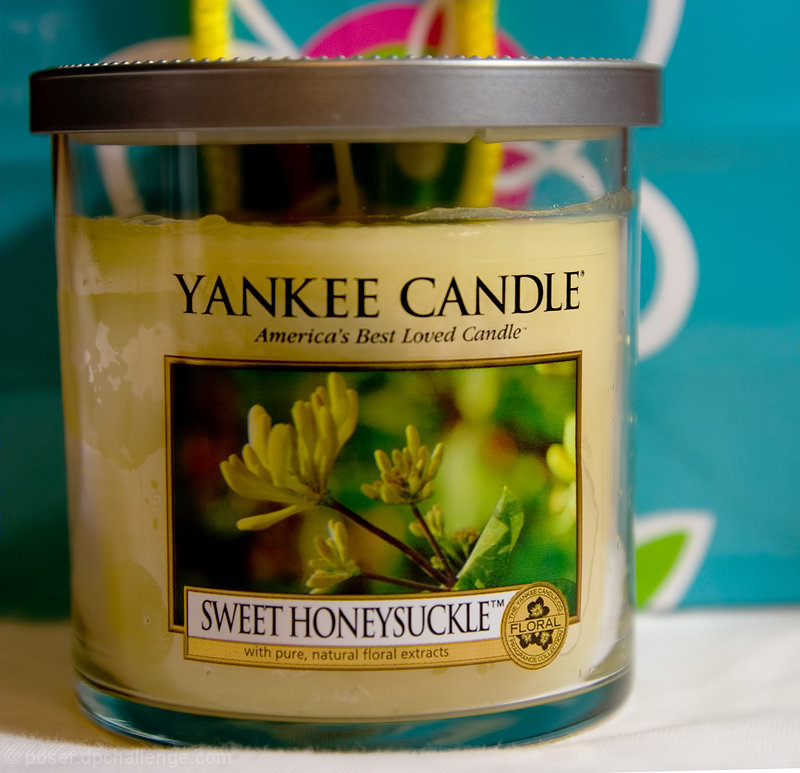
Liking the subject for this one, Yankee Candles are in every room of my house. Lets start with the positives: Nice close up of the candle, you can pretty much read every detail in the label. Negatives: The bg is distracting to me. May have worked with a light green to correlate with the label and bring out the coloring in the candle.
You've got part of the concept in product shot down. You've got a clear, in focus shot focusing on the product. Remember that a product shot is doing a couple things. Most critically it's selling the product via a story. Now that story can be told with dramatic lighting and production techniques or with choices in props and background.
With what you have showing, props and background would be part of the story. I'd start by moving back a bit from the product. Possibly reframe things to the left or right. You are so close that I can see every imperfection in the candle. Which isn't what I want in being sold. :) I like the blue color in the background, but the pattern provides additional distraction. Maybe shift things around a bit so you can't see the pattern?
I wish there was a slightly deeper depth of field. The very front of the candle is just going out of focus, which is bad because that's where the brand name is!
Product looks like it has been used, lighting is very flat. The bottom has wrinkles and is not flat and the design of the background is very distracting (reminds me of photography 101, don't have background trees coming out of your subjects head).
Good job of making your product front and center but you need to have that focus be dead on for an add - you'd have to use a bit more DOF if possible to keep it all in perfect focus. I'm not sure your background helps you here - the colors are good but the pattern takes away a bit from the product itself. Light is even and natural! (Commenting only.)






 Add photograph to your favorites
 Add photographer to your favorites


 Photographer found comment helpful.


