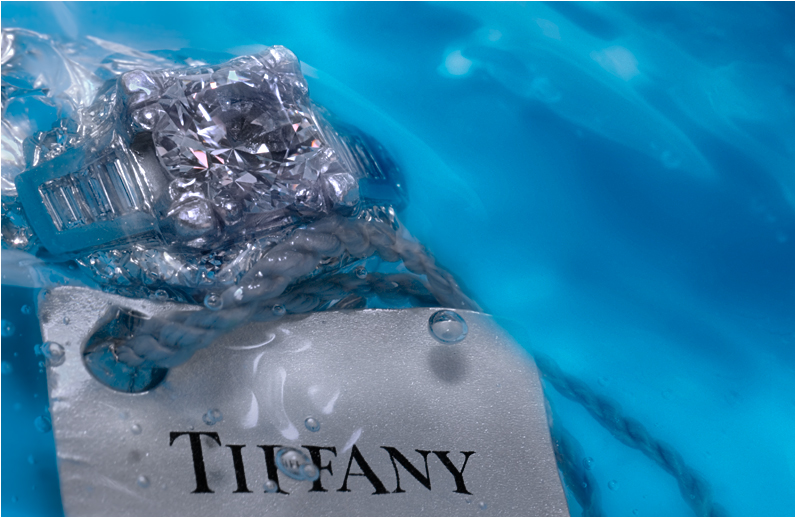
The blue of the water creates a very nice background. Maybe elevating the ring a bit more out of the water? I like the original approach and I believe this should have ended up higher.
:) Congratulations on such a high score! I love the blue/silvers in this, it's such a funny shot, because it is very much a real "product", and yet, it's something else. I like it.
The picture is beautiful, and the concept is great. I love how Tiffany is clearly seen (with the exception of the one bubble). Just wish the ring sparkled more from under the water. Other than the ring comment, I truly enjoy this shot. Good job.
What people do not realize is that this is not an ad for the ring, or even an abstract, but for that single perfect pearl of air. Those are priceless, you know. (Commenting only.)
WOW, what a great idea--product shots for a catalog of abstract art! I love it!
I have voted 8 on most of the abstract catalog entries including this one. Four of them I thought were stunning abstracts so I gave them 10s.
I understand that some people are upset about this set of entries. One of the important functions of contemporary art is to raise issues and push boundaries. This often gets people upset. Hang in there!
Odd title as this isn't really abstract. I can make out the object - a ring, and the words - Tiffany, so I wouldn't consider it abstract.
There seem to be a number of these - a collusury effort it seems - same title, different pages. That doesn't garner any additional points and makes me think this is less of an individual effort.
Not abstract enough dammit! But nice nonetheless, and a nice interplay between blues. The water element (one of my all-time favourite photographic elements) is used sparingly and to nice effect. 6





 Add photograph to your favorites
 Add photographer to your favorites

 Photographer found comment helpful.


