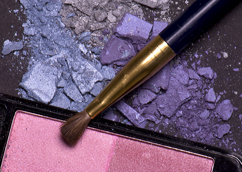
Shot just don't do it for me. The background is distracting and products should look new so the dust and stuff on the makeup thing (I am a guy so don't know what it is called) is very distracting.
Honestly for me this is cropped, or shot, far too tight for the subject matter. I like the idea and the use of colors but for me the composition isn't compelling, it doesn't draw me in at all and as I said it just seems too tight. 5 from me.
As you've effectively asked for comments (is it working?) here's mine.
I'm not voting because I'm in this challenge, but I think I would have given you a 6. I like the "quality" of the image - i.e. it's in focus and exposed well, and more importantly I like the composition with the strong diagonals. As a "product" shot I'm not so sure about it. I feel that all the fragments make it look very messy so I don't think it sends the right message because of that.
Hope this is the sort of comment you're looking for.
I really like this. Area of improvement that I see is to make sure your pink doesn't have the crumbs of the purple in it (as on the left side of the photo. I would have gently blown out that side. I really like the composition. It sits at an interesting angle. Good job!






 Add photograph to your favorites
 Add photographer to your favorites


 Photographer found comment helpful.


