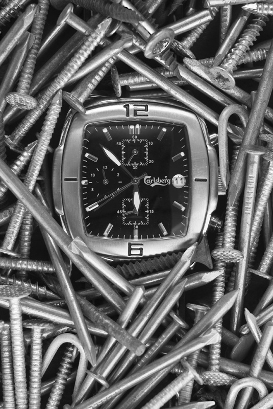
This was one of my favourites of the challenge. Also I noticed Carlsberg fairly quickly, I love that stuff haha. This would look perfectly natural as an ad in a magazine. Centering the watch was perfect, title works amazingly well with how you set this up.
At first I agreed with the commenter who suggested a square crop, but thinking of this appearing in a magazine the crop would have to be more like this so it works better this way. I guess it all just depends on how you see it being advertised.
I think I like this one better than your outtake but if you had the colours/contrast of that one in this picture it might have given you a higher score. Overall great work! And you're only 16 so even more awesome! I hope I get to see more of your work show up.
Heh. When I saw the photo I thought the title was going to be "Tough as Nails". :-) Nice idea and done well overall. A minor levels adjustment could help with the blacks some (need to be darker), and a CP would have controlled the reflections on glass for you also.





 Add photograph to your favorites
 Add photographer to your favorites

 Photographer found comment helpful.


