Congratulations on finishing in the top 20. Imo it should have finished much higher up. This was my only 10 given in the challenge. But of course I am no expert when it comes to judging catalog shots and reading through the comments this image received I am learning a lot about what can make or break a really excellent catalog shot. That's why this site and these challenges are so good for improving one's photographic skills and eye.
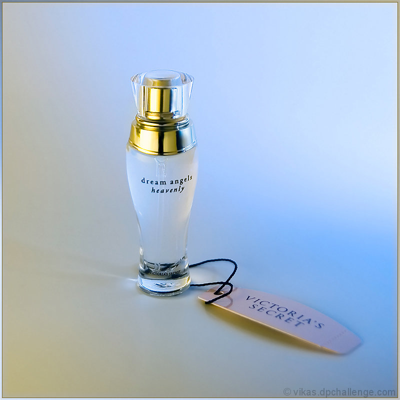
Very pretty and clean. The mood definitely fits the product.
Two tiny little nit-picks:
I would have removed the stem from the bottle. I know it is part of the product, but it seems out of place. A lot of ads remove the stems to make the bottles look cleaner.
In product photography, it is very important to get the color perfectly accurate. I love the colors of the background, but I suspect that the stuff inside the bottle is white, not pink or blue, and that that color comes from the background.
I'm not voting you down on either of these things, but I thought I would mention it anyway : )
Simple and clean, with the nice hint of color adding a sense of softness - keeps with that dream/heavenly theme. Probably just what the ad folks are looking for! (Commenting only.)
You have done really well on the lighting and colours here. They compliment the product perfectly. I also like how you have made the product small in the frame rather than zooming in a bit. Makes it all seem a bit more feminine and delicate.
I would have liked to see a sharper focus on the wording on the bottle. Really detracts in my opinion.





 Add photograph to your favorites
 Add photographer to your favorites

 Photographer found comment helpful.


