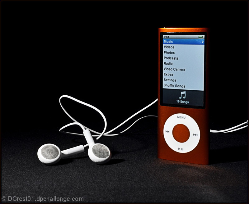
Product shots are usually characterized by very "clean" shots. This is not as clean as I would have liked. The main light is too hard and casts distracting shadows on the background. The texture of the background is also distracting (check any magazine--the backgrounds rarely have texture). The exposure between the ambient light and the screen is pretty well done, but I would have exposed the screen just a little longer so that the "white" part of the screen would actually be white. Then you could bring down the "blacks" of the screen in post-processing.
The product is displayed well in an uncluttered space and the lighting is OK, but it needs a bit something more, though I would be hardpressed to tell you what that is. (Commenting only.)









 Add photograph to your favorites
 Add photographer to your favorites


 Photographer found comment helpful.


