From the critique club:
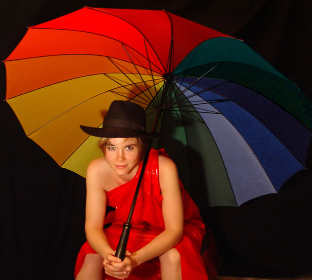
This is a very colorful and interesting composition. It is bold and it is outstanding. The fact that it finished above the 6 average, speaks of its strong visual impact. It almost touches on Pop Art. The model is great and helps the cementing of the concept. While the idea was not executed to its maximum, the message of the visual comes through with boldness.
Let us consider its minor oversights and mind you, this is only one opinion. When I conceive an idea with a model, I visualize the model's position. I then ask myself, "How am I going to light this.?" Your lighting direction concept was on the money. The effect is robust. You laid the foundation well. However, the fill lighting was not employed to support the main light. Also, when you have a model with a hat, you always need an extra light. So, this set up is a three light set up. Your main: the shadow fill and the slight overhead to define the hat. Remember, the hat is silhoutted against the bright warm colors.
Another important, but often overlooked point is hand and finger placement. Here the viewer has to study the hand to learn that the forefinger of the left hand is in between the fore and middle finger of the right hand. Look well at it and you may agree that the gap leaves another point to resolve. You always want good hand and finger symmetry.
The next consideration is the ambiguity in the models right eye. best to have kept the hair clear of the eyes, unless you are doing a close up with this effect. At a distance, often what is normal becomes questionable.
The following are strictly my preferences. I would have lowered camera to make a lower capture. I would have had model bring knees together. I would then have cropped a little tighter foregoing some of the cold colors on the umbrella to bring her attractive face closer.
However, take heart. The image is strong and pulled a lot of eyes towards it. I have to tip my hat off to you. This colorful umbrella and the wet look garment have proven very novel and a trip for the eyes. dan
Color portrait not colorful portrait.....
I was trying to make a colorful portrait. So i made this huge colorpot;)
Then i see that mine is the only one so colorful.. And the others portrait... Are just in color.. ;Þ
Thanks for all the comment..
Alot of useful information.
Lighting: even and nicely done, although there are a few places that would have been better if it was not quite so hot.
Pose: works well, but I would have preferred the hair not be across her eye.
Background: The black background is well done, but there needs to be more seperation between it and the umbrella.
Great colors, the umbrella is a wonderful addition to this shot, the shadows distract somewhat, the subject's facial expression is great, the red dress really contrasts well with the black background
This is well lit, well posed, and the model's expression is great. Only thing I might change is to get a different umbrella. That one is so colorful, is distracts from the model a bit.
I love the compoosition and color scheme in this shot. Your lighitng is subtle and helps to pull out thep depth of the shot. Nice addition with the umbrella!
TC
the props are a good attempt to make this more interesting, but the light from the single source below left is pretty harsh - underexposing a lot of the background and giving you pretty strong shadows that don't do much for me
Great composition, coontrasts, and focus. Your model has a nice relaxed look that totally makes the portrait. Color saturation is nice and vivid, while still not sacraficing skin tones...... I give a 9
...and a few other colors as well! The colors and black background make the flesh-tones pop out of the picture, but I find her hands/legs split the attention with her face. I'd try cropping just below the top of the grip on the umbrella, around her elbows but above the knees.
I think this shot is very well done but I find the hair across her eye to be distracting.. it's such a minor thing, but I think if it were moved an inch or two it wouldn't make her right eye look funny.
Pictures like this makes me jealous because I could never get this shot as good as it is if I wanted too. Great job. 10 One day I will get good at portraits.
this displays a brilliant use of colour for the challenge. most amazingly about this shot is that your model remains incredibly attractive even with THAT hat. and isn't it unlucky to where a hat with a brolly? i think it's one accessory too many. but this is a great shot, nice and bright, possibly slightly too neatimaged? also, i might have considered cropping the top off the brolly, so the girl filled more of the shot. still, as i said, great shot. 8.
Like the umbrella and the redish light. I must be a neatnick because I find myself wanting to brush back that falling lock of hair that's getting in her eye.
Love the color and the lighting. I only dislike looking up her dress, it seems out of place for this shot. To add a sexy feel it should of been a bit more smooth in my opinion. 7~ Good luck in the challenge.







 Add photograph to your favorites
 Add photographer to your favorites

 Photographer found comment helpful.


