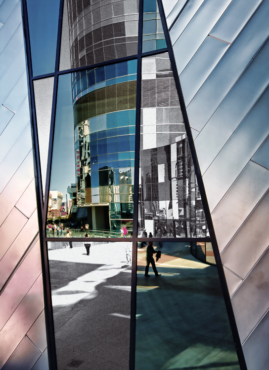
A fantastic composition ruined by selective desat.
I meant to revise my comment before the challenge ended -- it was a bit harsh. I do love the composition, and I think the lines and shapes and fragmented nature of the composition were enough to hold the viewer's interest. I've seen worse applications of selective desat, but I think this would have held up nicely as a straight black and white, or with a very subtle, but uniform color scheme.
So often these reflection-in-a-building-shots are just kind of "blah." This is very well done. It is well composed. The lines are awesome. The post processing is artfully done without being over-done. Nice job, here.
I'm going through the entries, stopping at those images I feel have had the benefit of an unconventional eye and dwelling a little longer to try to see and appreciate what you saw. This is one of those images.
Positives: I really like this - The metallic colour palette is really nice, particularly the side sections. The architecture, the geometry, the reflected scene all add interest - I think the selective desaturation works too - it serves to emphasise the most interesting (colour) sections of you image.
Critical stuff: Nothing at all.
Overall: A very successful image - I like that we can see ample evidence of photographic choices you made.
Interesting idea & Im not sure its worked for me, the cladding beside the window is great, love the colours, the tilt on the building in the reflection I think is what puts me off.







 Add photograph to your favorites
 Add photographer to your favorites

 Photographer found comment helpful.


