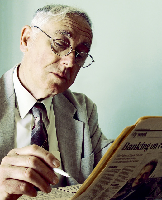
My Dad, a journalist and writer, in typical stance as he checks the financial section.
I wanted a subdued tones for this to suggest the feeling of the business he works within, which can be gritty and ruthless at times.
Lighting is sunlight. I was well aware of harsh shade this caused, but felt that it did not detract from the form and facial features - amd when dodginig it back it did not look so strong.
Edits:
> convert to Lab colour
> slightly blur channels 'a' + 'b'
> apply minimal Sharpen to 'Lighten' channel
> clone out some wayward hair
> Channel Mixer
> Hue/Sat
> crop
Statistics
Place: 30 out of 92 Avg (all users): 5.9958 Avg (commenters): 7.1333 Avg (participants): 6.0746 Avg (non-participants): 5.9649 Views since voting: 1793 Views during voting: 366 Votes: 238 Comments: 38 Favorites: 1 (view)
I love this portrait, one of my favs of the challenge! I would classify this an emotive portrait, especially because of the 60's feeling to it! Nice work!
Love this image Jon..your lighting threw me a bit as, judging from the shadows on the face (especially round the eye)it appeared to be coming from a lower level than the subject.Maybe just down to the angle of the head..you can tell I`m a real novice at this :)
This is the only portraiture in the challenge that seems to show the subject in his realm. Love the added detail. My only real complaint is that the pen is a little blown out drawing my eye to it and away from the subject.
TC
For some reason this has the feel of a frame from a 1950's-era movie ... maybe the tones remind me of aged TechniColor ... as a portrait it feels more like a candid than studio -- would have been an interesting entry for the Newspaper challenge!
Very interesting portraiture...not the run of the mill. Effective pose and composition. Lighting is a tad hot; perhaps that was intentional for the high-key effect. I would prefer a bit less harsh, but that's just me. Good effort. :o)
Very good choice of subject matter and I like your angle of view getting a clear shot of his face and the newspaper, as well. I find the lighting to be too harsh and I wish the print on the newspaper was more blurred so as not to be distracting...in other words, get a shallower DOF.
Love the pose and expression! Have to think about the harsh lighting some more, it's unusual, but somehow it seem to fit. One of the best portraits overall - 9
Like the composition and the lighting in this image.
The more unusual approach of lighting from low level, throwing shadows upwards has added impact to the picture.
Good light - good control of exposure too - highlights are just in control, shadows have detail but still look like shadows. Good character in the face, though perhaps getting him to focus on the top of the page would have made the eyes feature a touch more: they're a bit too closed here, I think.
i like this a lot. i don't know if it IS a good portrait though - it seems too not posed really, but then this could be testimony to your models fine acting skills, and he is posing a non-posing pose. i adore the colours and greeny-whites; did it come out of the camera that way? all the colours have the same tone to them, like the suit jacket and the background. i think this is great - 9
He do's not look like a journalist, more like someone looking for some work in the newspaper and drawing a cirle around posible jobs. But lets forgett the title because the image is great. Love the lightning you get from the window on the left. This is one of the top photos this week.






 Add photograph to your favorites
 Add photographer to your favorites

 Photographer found comment helpful.


