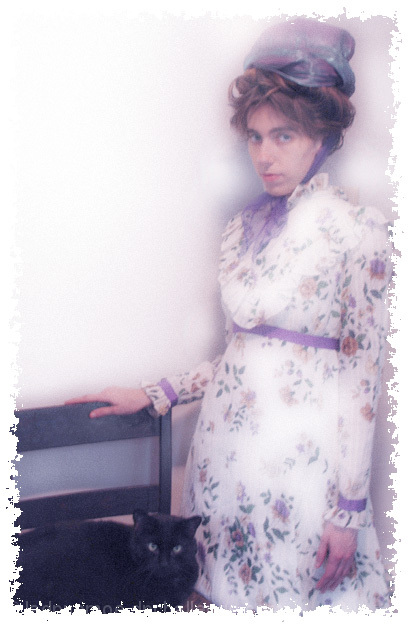
Lighting: The lighting if generally fine, but the dress appears a bit hot in places. The soft focus is over-done I think.
Pose: too stiff and rigid.
Background: Works. I don' t normally pay any more attention to a border than I do titles, but this one does not work for me.
I can't tell if this is a modern portrait made to look old, or a snap of an old portrait. If it's the first, you did a dang good job of it. I don't personally care for the effect, but it IS well done. You got the framing down pat for an old school portrait, that's for sure. Placing the lady right up against the frame and putting the cat at the very bottom makes this feel un-ballanced and gives it a raw feeling also very reminiscent of shots from the early days of photography.
TC
I like the overall effect, good job conveying an "old-timey" look ... the "distressed" border is a good idea but maybe just a little too much; I'd like to compare with a version with a less aggressive application of the effect.
There seems something incongrous between the color and the rest of the effect. But a lot of work obviously went into this, and the antique feel was really well done. Nice work. It's just that color.... :)
I can' t say I like the borders, they threw me off. Maybe make them more subtle (not so ragged)? In my opinion, the large empty area is quite distracting, but then again it does help focus the attention on the models. Great models, costume, and posture, they give the picture an authentic and antiquated feel, as if an old picture was painted over with color paint. Cool effect!
I like the idea, but I feel the softness doesn't convey much softness....it conveys stiffness and hardness to me.....yet, it does remind me of many old family photos I've seen....they always seem stiff to me also.....rating this a 8
This is a good idea, but something bothers me about the implementation. I think it is the softness of the photo. I am sure it is what you intended, but I am having a hard time enjoying as much as I am enjoying some of th eother entries.
Nice concept, but if I remember well, portraits done in those days were shot quite so thight. I would have liked seeing a little bit more background around your subjects.
Bare upper left corner looks washed out, un-natural. Border should be a bit softer at the transition, like the shadows around the subject. Still, I like this.
The plain white area of the wall detracts from the focus of the photo and this border is a bit much. I think this would have been a better photo if you had centered the subject and then perhaps placed her in a vignette which would have portrayed the era you were shooting for
Had the border not spoiled this I think it could have scored well, and is actually quite novel. However, it's so intrusive that it kills much of its charm. Clever idea.








 Add photograph to your favorites
 Add photographer to your favorites


 Photographer found comment helpful.


