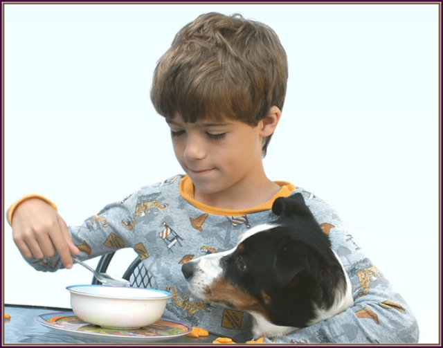
I am sure some of you will feel this was a snapshot. Nothing could be further from the truth. I use my patio for a makeshift studio and in this case we started out with a kitten on the table drinking milk out of the bowl, but then the dog decided to join them. I removed the kitten from the whole scene and just left the dog take over. Here you can see the face of a child enjoying himself and the look of that dog anticipating a taste.
Statistics
Place: 75 out of 92 Avg (all users): 4.8613 Avg (commenters): 5.2727 Avg (participants): 4.2500 Avg (non-participants): 5.0862 Views since voting: 1061 Views during voting: 353 Votes: 238 Comments: 24 Favorites: 0
Composition:
While it is a very centered photo, there is enough going on to keep your interest. The real downfall is your background. It's just too much for the photo. An out of focus kitchen would seem more appropriate for this shot. And quite a bit more natural of course. After reading your comments I'm surprised you removed the kitten. I think "Breakfast for Three" would've made the photo that much more interesting, as well as 'cute' :)
Lighting:
I think your lighting is good. His face isn't hid in shadows, and your exposure is just fine. I think the real problem is the brightness of the background, you take that away and the photo looks a lot better.
Technical:
I think your photo is technically flawless, everything looks good as far as your technique is concerned.
Post-processing:
You might want to consider adding a touch of contrast to it. It is a touch on the flat side right now. Other than that it looks good.
Overall:
This is a great shot. I like it a lot. With a more appropriate background I think you would've scored higher. But even the best photos will get hit hard if the voter doesn't see it as fitting the challenge. As you said many will feel this was a snapshot, and they voted accordingly. I think people were really looking for the "Sunday at Sears" look. ;)
Hope your photos score more deservingly in the future.
Lighting: the lighting is good, but seems to have a slight color cast.
Pose: more of a candid than a portrait. The motion blur is distracting.
Background: works.
Really good lighting and detail. With the flat background I'd be tempted to drop in something else, especially for printing. I'd also crop in tighter to make it more "portrait-like" -- I think your subjects are just a bit overbalanced by the amount of negative space.
How sweet! The lighting in this picture is just a bit flat, almost creating a hazy look. Perhaps a different background or a bit stronger key light could help. :o)
Wonderful portrait. Tells a great story. reminds me of Lassie. Is the whole picture tilted slightly to the right? Would it look better straighter? I like the muted tones. Sometimes if you take the sponge tool and saturate the color only on his eyes it gives the face a bit of a focus.
IMHO this looks more like a snapshot (edited to look like a portrait) than a true portrait. I don't have a problem with the boy posing with the dog. Your lighting is very unimaginative. If you used a couple of lamps and moved them off to one side you would end up with a shot with more depth. What happened to the background?
TC
I really like your choice of subject matter but find the exposure a bit too lacking in contrast. Also, I wish there were a contrasting background instead of the blown out white.
A lovely idea. To me the focus seems a little soft and would have preferred a soft warmer shade in the background as I find the present one very glarey. Lovely lighting and skin colouring on the little boy...........dog looks like a real sweetheart.






 Add photograph to your favorites
 Add photographer to your favorites

 Photographer found comment helpful.


