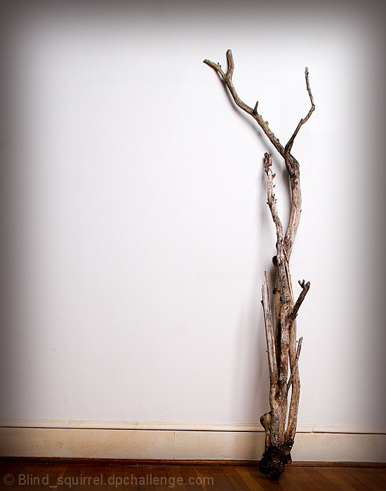
You met the challenge well, although I think the reason you didn't score higher is because while you did meet the challenge it's not that exciting. Others have stated that they liked the simplicity in your image so it's all a matter of personal choice.
I know others may not like the vignette I think it creates a nice border against the white background. The one thing that sticks out the most in your picture is the slight slant at the bottom of the picture, as some other commenters noted.
I see you only have four entries since 2007, does this mean you are entering challenges again? I hope so, your portraits are very nice.
I really like the simplicity of your shot. The floor appears to be slightly lopsided so it appears to be a mistake, either make sure it is straight or shoot it using a bigger angle to show you are doing it on purpose.
Needs a tat of straightening so that the branch won't fall over to the left. I like how you've lighten him: the darker part, out of the light, nearly creates a border around the photograph.
Okay this is a cool shot. I love simplicity and this shot does that well... Good job meeting the challenge theme and keeping it interesting. My only gripe would be that the floor line, (where the wood meets the baseboard) is a tad tilted... but its very mild and that's me being picky :) 6







 Add photograph to your favorites
 Add photographer to your favorites

 Photographer found comment helpful.


