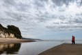
A lovely grayish evening at Goleta Beach. Light was subdued but kinda silvery. This is tonemapped from three bracketed exposures (handheld) then Topaz'd a bit. In other words, nicely processed, yes? I do like the way it came out, to tell you the truth. And I like how it seems they are staring rather reverently at the antenna. I probably could have/should have cloned the antenna, but then you'd lose the story. Of course, I'm undoubtedly the only one who sees the story in the first place.
And I predict someone will dislike the border. :-)
[Apr. 1st, 2010 09:44:37 AM]
Is it the title? Is it just boring? Do I just really suck that bad? What?
[Apr. 5th, 2010 11:37:44 AM]
Hmm. So the border is universally hated, the picture has distractions (people), the cropping is too tight (I had no room on the right or the left, could add back in the top and bottom, though), the subject matter is boring, and it just all around isn't good. Ah well. I liked it. I have no taste apparently! :-)
[Apr. 5th, 2010 10:17:44 PM]
Oh, and this is in my rotation of desktop backgrounds and every time it comes up it makes me smile. :-) Sorry it didn't do that for most of you but glad it did for a few.
[Apr. 7th, 2010 10:51:48 PM]
Alternatives:
Statistics
Place: 137 out of 350 Avg (all users): 5.7847 Avg (commenters): 6.4444 Avg (participants): 5.7980 Avg (non-participants): 5.7556 Views since voting: 801 Views during voting: 240 Votes: 144 Comments: 20 Favorites: 0
Well, I try to be honest -- the risk, of course, being that I might step on the toes of someone I really admire. Title and border aside, I do like this. The crop still feels a little tight to me, but there is definitely some intriguing energy between the people and whatever is on the hill. Given that -- and now that I think about it -- I can't come up with a better title.
This should have done better, IMO. I love the people, the splash of red, the composition and the processing. Plus it's a beauty of a place. And you made it tell a story. Congratulations.
Seriously underrated! I gave this an 8, and it still cracks me up (personally, I love the title, and I barely noticed the border so it must not have bothered me). And yes, you did a lovely job with the processing. Go pat yourself on the back :-)
See -- I just really like your stuff! I gave this a 7. The commentor is so wrong about the people -- they make the shot. Love the splash of red, love the people. The alternative shot without them is just not as interesting. The border grew on me, but not a lot :P
Regarding your notes: I sometimes like the way a border sets off an image. I have realized, however, that any use of a border will find some people not liking its usage. I rarely use a border now, and on those rare occasions when I feel it is appropriate, It always gets a comment criticizing that choice. I figure each comment about it represents multiple low votes for that aspect.
Despite the criticisms, I feel a high 5 is doing well in a freestudy and this entry did find it's share of fans, including myself. I gave it an 8. I tend to like stuff that is a little quirky.
Cute. Good detail and I like the tension created with the people just off the edge. Nice use of diagonals and triangulation. Just some observations. Good luck.
The crop to the right feels a little abrupt. Would prefer to have seen the subjects have a little more room. Unsure about the border. Ridiculous title.
I usually don't care about borders either way (neither anti or pro borders), but I do think the border detracts from this image. It's a very interesting image with nice, subtle colors with the splash of red, but the white border washes it out too much, imo. It doesn't change my score -- it's about the photograph, not the border, and the photograph is quite nice. 7
I think the border doesn't work for this image. Then the person in the frame distracts from the composition. The crop doesn't work too well for me either (i'd have loved to see the reflection of those trees on the cliff). 5







 Add photograph to your favorites
 Add photographer to your favorites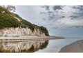


 Photographer found comment helpful.


