I think this is a far better portrait than the one I submitted. I was disappointed in the voting on this challenge. Many great shots such as yours scored below what I felt they deserved. Proof that voting here is wackadoo ;)
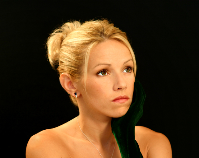
This is a beautiful model and a very classic pose. The lighting seems to work very well though it seems a bit harsh on her hair on the left. Also the focus on her hair is off in the back, maybe if her head was turned so the but didn't show? The green velvet glove is a nice touch but it blends right into the background and her necklace was cut off. Normally that would work, giving a line going in and out of the shot but in studio shots they frown on jewelry getting cut off. A 5 to start, bumping to a 7
If this is your love, you are truley fortunate, she is quite beautiful and so is the shot, the hot area of bright green on her glove is the only flaw for me. Wonderfully done - 9 - .
Lighting: The lighting is great.
Pose: The pose works well, but I don't care for her expression. I can not tell if it was intentional, but I am guessing not, but the focus at the back of her hair is getting a bit soft.
Background: The smooth black is well done.
One of my top picks this theme.. excellent lighting. What would have made it a ribbon pick? The negative space on either side could have been removed and thus moving your subject out of dead center. Also there's something hard/stiff about her mouth that don't match the excellent gaze of her eyes. The pulled up hair distracts me a bit (could be the dof or the loose strands) Lastley the hand fades too much into the background just around the chin. (please don't get the feeling I don't like it -- I do!)
I'd like to see how this looks with the hair in the back either more blurry, or the hair sharp throughout. Maybe because it holds the brightest highlights it somewhat draws the attention away from her face. Or perhaps burning it a little so it would fade into the background more smoothly would work instead. I think I'd also try a vertical crop of the same shot.
Nice color and lighting--the all important elements in a portrait. I'm afraid the glove blends a bit too much with the background. Perhaps a soft light placed behind her would have brought up the edge details.
Only one negative comment: The dark colored glove with dark background feels like is cutting the body in 2 pieces.Light is perfect Dof maybe too shallow,8.
Beautiful model, lighiting, and focus. I am a bit confused, however, as the title is "My Love" yet she looks more angry than in love. I would crop the left side a bit, giving her more negative space on the right, as that is the direction she is looking. :o)
Don't think the black/green glove works well with the black background - not enough contrast so it looks like a gap or her shoulder has been cut off and is floating in space S niy more DoF to keep the hair all in focus, or less DoF to blow it out more would work better I think too - feels stuck somewhere between those extremes
Lovely eyes. Nice skin tones. I like the simple framing. Unfortunately her hand (it is gloved, right?) gets lost in the background. Better not to have cropped the pendant, or else have her remove it entirely.
beautiful, classic, no suggestions from me on how to make this better, just my compliments on a well composed all around great portrait, sorry if that doesnt help you, but doesnt seem like you need help here.
I think I would move her to the lft a little and leave an uneven amount of black. whatever she is staring at or thinking about is also part of the image and he needs some room too. The extra negative space on the right implys that there is another part to her life, but the extra negative space on the left is just extra space and doesn't contribute. try it
Very beautiful young lady! (Have I seen her here before?) Nice shot. I'm not sure I like the yellowish cast to it. It also seems a little flat. You lose her nose almost. If more of the lighting was to the side it would help. The black glove also gets lost but against the background. I REALLY love the hair lighting and the catch light in her eyes. I need to find out how to do those two things for myself!
TC
good shot, lovely woman, but it may have looked better if her glove were not so close in color to the background, you almost can't see it at all, a lighter colored clove, a neutral background, or maybe just some additional light on it to bring out the green more
Excellent lighting on a beautiful model. Her expression is reallly dreamy. I'd like to see a tad more light on the green glove so that there was some demarkation with the background. Overall - an exceptional submission.
Your love is lovely, her eyes look very nice in this picture but I would have liked a different look on her face, maybe a bit more "sweet" and not worried...
The green stripe acros her hand/arm is also a bit distrackting.
Her hair is a little out of focus, and her expression is blah, but the composition is very nice. there seems to be a little edge on her glove that is distracting.
she's a beauty. I like the velvet glove, but it doesn't stand out against the black background. I'm not sure what you would do, except maybe use a different color? Great photo!
Love that green glove! Beautiful model and interesting expression, but maybe a bit too much hair light? With less highlights in her hair and maybe a slightly less yellow color-cast, I think her face would stand out more.
I am not a very good judge of portraits - but I like the skin tones and the dash of color and the highlighting of the eyes. Your viewers are readily pulled by the beautiful brown eyes. Just wished it was a little bit more off center.







 Add photograph to your favorites
 Add photographer to your favorites

 Photographer found comment helpful.


