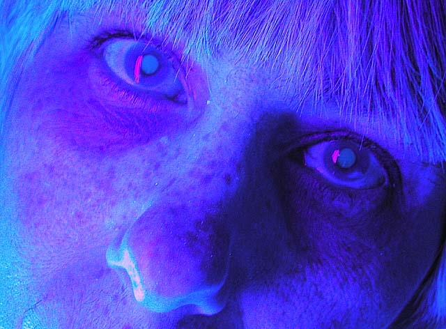
OK, that's just scary. I admire your daring approach, but it's just too over the top for me. Not quite the "formal studio portrait" that I think many are expecting here. It might have worked better with a good exposure turned into a duotone, but this looks like it's reversed and solarized and the result is... well, weird.
This image is just a bit to artsy for my taste, especially when considering a color studio portrait...it isn't really what comes to mind. Interesting lighting and effect, however. :o)
Wish I could see the rest of the model's face, perhaps that will help give the picture some expression? The lighting/color doesn't agree with me (in my opinion, anyway) - less blue might be better. The picture gives out a nice surreal feeling - the reddish highlight in the eyes helped reinforce this. Very creative!
This isnt really what I expected from a "formal colour studio portrait" . Sorry but this is neither flattering to your model or interesting to the viewer.
Interesting idea but I think you might have been better off leaving it with the natural lighting. The negative image on this is really distracting and hard to look at for very long. I like the set up and the way the face fills the shot but the post processing really hurt this one for me. A 4
This is really just weird and unappealing. I don't mind overmanipulated portraits like this but there isn't anything to creative at work here--it just looks like you did some radical hue adjustments in selective color.






 Add photograph to your favorites
 Add photographer to your favorites


 Photographer found comment helpful.


