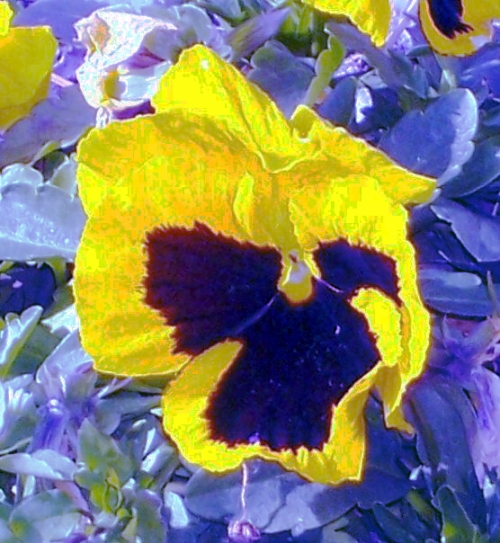
A few of you understood the psychedelic 60's look I was aiming for.. An I thank you for that.. Laughs.. Having actually grown up during that time, it was an interesting and different period of our past and culture..
at first glance feels like a snapshot with a little too much post processing - However, there are some strong complimentary colors that make it nice to stick around and look at though.
I have no idea what you were going for here. If I've somehow missed the point, feel free to message me. Beyond that, the color is just over-processed looking to me, it doesn't look artsy, at least to me.. So, Good try, I'll give you a 5 because I really dislike this shot, but because I think you were at least keeping to the spirit of the task..
I'm not a huge fan of florals in the first place, and the speckled treatment this has been given just comes off looking strange to me. Sorry to be so harsh, but I'd rather leave an explanation to accompany a low side vote.





 Add photograph to your favorites
 Add photographer to your favorites


