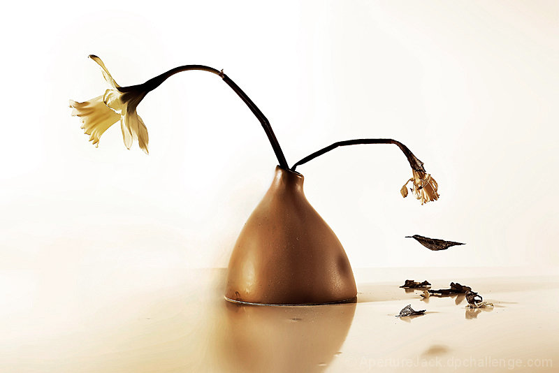
This took SOOOOOOOOO long to do. When I first had this idea I thought of it completely differently. I pictured it in Black and White with a black backdrop rather then a white one. But I actually like this better then when I first imagined it. I set up the shot with 500 watts of light directly to the left and 500 watts of light directly to the right. Then I took 100 watts of light from the bottom up beneath my backdrop. This lighting setup blew out most of the edge of the table I was setting the photo on so the table would blend with the background without me having to spend hundreds of $'s on photo paper. The vase was just an ordinary vase for holding flowers, nothing special, and the flowers are daffodils. One was more wilted because it wasn't sitting in the water, the other was fine.
For the leaf, I tore a pedal from the wilted flowers stem and poked to holes through it to put fishing line through then hang from the wilted flower. It took a while, but I eventually got it so the fishing line wasn't catching any light and it looked like the pedal had dropped from the flower. The table is just the same metallic surface I use in all my studio work.
Post-Processing was difficult:
1. USM to sharpen up the photo
2. Curves for lighting
3. Hue/saturation for sepia tone
4. Vibrance (Photoshop CS4) for better seipa tone
5. More curves to make background almost completely white
Errors: I always hated the kinks in the stem of the right-side flower. UGH!
Outtakes:
Thanks for the votes, i hope this really does well! :D
Greetings from the Critique Club.
Hello Coleman, I’m Alan.
You garnered a 8 in my voting on this challenge, not many received over a 6. Could it have been a 10, unable to test theories, my minds eye says yes.
A bit of noise reduction would have mellowed out the gritty feel, and softened the edges.
Selective saturation leaving color on only the vase and forward shadow, not only would help the “life flower” but add texture.
When I first looked at the image it seemed to me the vase was ½ submerged in a swift, smooth surfaced flow of water left to right, I think a bit of dodge and burn might have enhanced that to bring in a bit more depth.
Still yet a 8 is not easy from me, and in this challenge difficult, so as is very good work..
If you have any questions on my insights please feel free to PM me.
Alan.
I like this idea but I think the composition could have been stronger to direct the eye where it should go. All the pieces are there, I just think they could fit better.
This is an image that I'd like to have to hang, but yet one that needs a specific place. I like it enough that I'd probably work to make the right space for it.....9
6 - I like this, especially the unusual disappearance of the vase (or is it the vase) - however, I prefer 'life' as the main focus and therefore want it to be on the right hand side and/or dominating the image more. I like that the visual matches your title, left side right side... but still..
Pretty. I dislike forced metaphors, so I must ignore your title. Is it fine art? I don't think it is, but it is delicate, if not somewhat overdone in post (too sharp, levels or something too adjusted). I would have enjoyed this in a deeply contrasted split tone... maybe reds in the highlights and blue in the shadows. I think the falling leaf is contrived, and I don't like it. The composition is too centred, and would have benefitted from a different choice of framing. Lots of space on the left, I think. Plus, I don't understand what it is, other than what you think I should be thinking. I'm looking for some kind of connection, in all of these images, and it's difficult to find one.
Would I hang this on my wall. Perhaps, I like the composition. I judge on what I would hang in my apartment. I would like to see this smaller and in a "large" frame. Just like good art should be. I give you positive 7
The underground where the vase is on looks like a stream of paint. Too bad about the "artefacts" created by the processing. I always hate when that happens and you can't get rid of it.






 Add photograph to your favorites
 Add photographer to your favorites


 Photographer found comment helpful.


