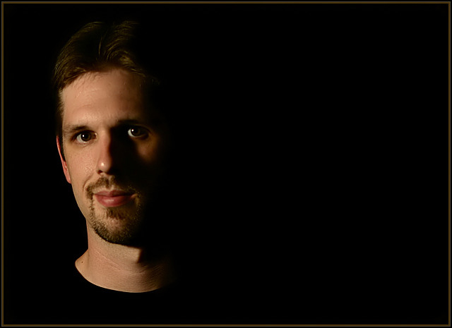
One 60watt lightbulb, a black background and a black shirt (acually, the same shirt I wore in my "Choices" entry)
Post Processing:
-Cropped
-Lightly softened in Neat Image
-Curves & Levels to make background solid black
-Cloned out a light spot and some facial defects :)
-Resized
-Added Border
-Saved for web 100%
Statistics
Place: 26 out of 92 Avg (all users): 6.1494 Avg (commenters): 7.2000 Avg (participants): 6.0000 Avg (non-participants): 6.2081 Views since voting: 1366 Views during voting: 405 Votes: 241 Comments: 35 Favorites: 0
I'd like to know your motivation for the negative space ... it works OK but I don't immediately see the purpose of it. With the lighting and exposure you have, you could crop this in half and have a very nicely-rendered "typical" portrait -- maybe that's reason enough for the treatment you gave it.
I like the negative space and the lighting you used in this shot. It adds quite a bit of emotion. I might have cropped a little more of the negative space but this is a might nice shot.
I think this is a nice portrait, however the lighting seems a blit too dark. His head fades into the background. I like the overall dark tone to the photo, but would prefer to be able to make out the features on the left side of his (your?) face. The black t-shirt makes it look as if it's a mannequin's head - no body. :)
A brave approach to leave so much negative space in the image, I like that idea but it may just be too much for some. I also like the lighting and that little touch of light on the left cheek is perfect.
I would have desaturated the lips a bit and would have allowed the light a slight shift to remove the visible part of the left bottom lip. Otherwise, it has a great visual appeal. very good composition.
Of all the portraits in this challenge, this is the one that I come back to often. Composition and lighting are just exquisite ... I love that the shadows and shirt blend with the background and that the left eye is not under the shadows (seen a lot of these with what I call raccoon eyes). On the other hand, I just wished you used another model just because you're so recognizable now :-) ... no offense meant because you're an attractive model but the recognition factor might turn off some readers and give you a low score because you just won recently... wonderful job ... I hope to follow your set up someday.
I like the dead space, but the shadow cast by the nose is a little bit too dark and washes away alot of the face. Perhaps a little more light on the right side would have helped it (reflector maybe). Nice Job.





 Add photograph to your favorites
 Add photographer to your favorites


 Photographer found comment helpful.


