Adjusted in RAW: WB adjusted, minor use of straightening too. Clarity +100, vibrance +30, saturation -40, highlights and lights -100, darks +40, noise reduction (luminance and color +100), blue saturation +30, lens vignetting +20.
Opened in CS3: cloning, sharpened by using layer mask, high pass, and overlay adjustment. Thin border added. Resized.
Statistics
Place: 135 out of 193 Avg (all users): 5.0464 Avg (commenters): 5.4444 Avg (participants): 4.9200 Avg (non-participants): 5.1809 Views since voting: 617 Views during voting: 369 Votes: 194 Comments: 9 Favorites: 0
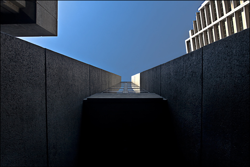
More than any other entry in this challenge, I wish this were in black and white. The composition is unexpected and perfect, but the color adds nothing. In fact it takes away from all the work you did to make this abstract (the blue sky identifies instantly as a building).
Art is a funny thing in that while it has definitions, those definitions are different for each person either creating or viewing the art. I am sure you probably see this as an excellent interpetation as Fine Art but for me it doesn't convey my feeling or thought of what Fine Art is. Because of that I scored this low even though it is a well done photo.
The perspective is interesting. took me a second to get what it is. At first i thought it was some kind of wall with a train going through it. Its got some dark areas here and there. I think i would have liked this more without the white building on the right side and the gray structure on the left for the sake of symmetry. So bottom line, i like, but wished there was more even lighting and symmetry.





 Add photograph to your favorites
 Add photographer to your favorites


 Photographer found comment helpful.


