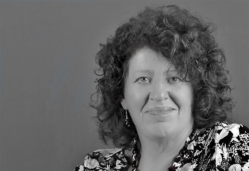
This is wrong on so many levels. The pose is unnatural and forced, and the contrast is flat. But all this strengthens the deadpan feel of the whole thing -- and it makes me smile. Eight points for you.
Sorry but for me this really just seems like a portrait with nothing special and, imho, no Fine Art quality. May just be my opinion and the great, terrible, funny, crazy, stressful, interesting thing with art is our varying definitions. Good Luck.
She's got a lot of character and your lighting is nice. I think maybe a tighter crop would bring that out. In this case, the negative space is working against you IMHO.
I'm sorry, simply not "fine art". This is a portrait, and would not work as fine art. I don't know her, and through her, I fail to understand you. My favourite fine art pictures force me to think in ways the photographer wants me to think, or to see that which is otherwise unviewable. I don't necessarily mean in terms of subject matter or the accessibility of the components of the image, but in that invested by the photographer in the image. I know what this is. It's a portrait. Technically, it needs lots of work; the sharpening did not work. The lighting is poor, and so the image is "flat". The tones are not good. Please try again, should there be another "fine art" challenge. Tell me something I don't already know.
I like that this is an honest portrait. I don't much like the skin treatment, it seems a bit too plastic. I like her expression, and her direct way of looking at the camera, but I find that the background doesn't frame her, doesn't add much. Also, the processing is a bit on the strong side overall. Honest portraits are rare and good.





 Add photograph to your favorites
 Add photographer to your favorites

 Photographer found comment helpful.


