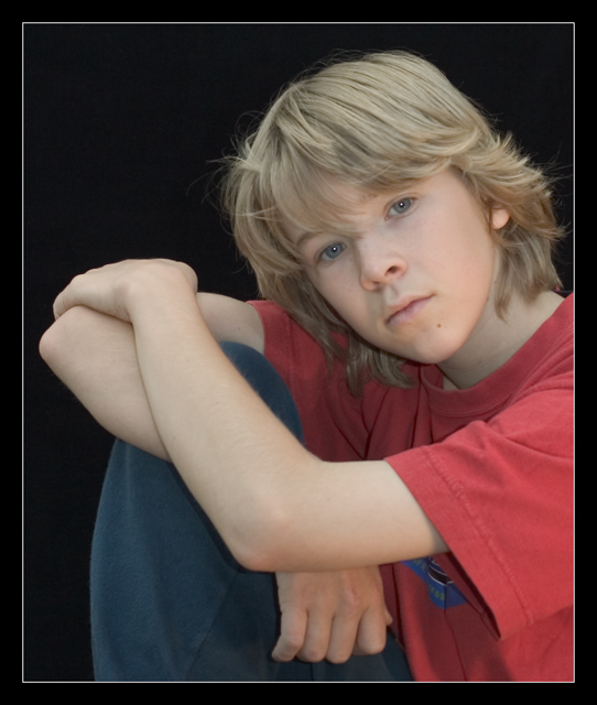
Combination of pose and border really make the subject look "boxed-in." Makes me wonder if that's an expression of the personality of the model or the photographer.
Nicely posed and very subtly lit. Great use of negative space without it becoming overbearing. Your colors are a tad bit pale for my taste. A bit of a boost in lighting or in levels/curves in PS may make it look more vibrant. How did you get the catchlight right in the center of his eyes? It almost looks like you added the catchlights in...
TC
Lighting: Very nicely done. The only comment I have on it is the position of the catch-light, in conjuction with the dead-center gaze, is unsettling. It does however pull the attention to the eyes very well, but hold it without letting it wonder the image.
Pose: The pose is great. The lines of the body and legs, together with the space created by the arms, serve to pull the eye to the bottom of the face, where the tilt of the head moves it on to the eyes. As I mentioned, the catchlight and gaze work well to hold the eye, but I am think moving one slightly off center of the other would have directed the eye to wonder the image a bit more, only to be pulled back in. I can't help but think, if the captivatingness of the eyes was your intent, if a tighter crop (cutting the left arm on the bottom and right) would prevent me from feeling like I am missing part of the image by being stuck in the eyes.
Background: Black works very well with this. Just so someone says so, I like the white border, it works well to do what a border is suppose to do - support the image. the large black border around the white border I could do without, but the white works.
Nice! That's the kind of shot that even the subject will like...even if not until he's older. I think the bright light in the center of the eyes is harsh. I'll hope that some of the other voters gave you a solution for it, and I'll look for it after the challenge is closed. Luck!
Very even, soft lighting - over all feel is a touch flat/ lacking in contrast though. Arm placement feels a little uncomfortable, crossing/ cutting the right arm in particular
Sam is great - shot in subdued lighting (looks like single source). Black background works well with the skin and clothing colors. Border detracts and should be removed.
Very nicely done. I like the pose, lighting, and background. Maybe it's the light skin and blond hair against the black background, but I get the feeling it's a bit over exposed. The skin tones look too white. Overall, it's a very nice portrait in my opinion.
with this type of pose centering the subjects face works better then an off-centered approch. also dressing him up in nicer clothes would make it look more professional.
nice shot, that captures the feel of a boy that age. The colors could be a bit more radiant, perhaps a bit fiddeling with the levels would do miracles.
A very natural look, with sophistication all out of proportion with the subject. You have a normal kid in a high-class shot, very nice. Focus could be a tad sharper. Great job overall.
This is a really cute kid. I wish I liked this portrait better. I can't quite put my finger on it. It might be the soft focus. His hand and arm look in sharper focus than his face. The colors are a bit washed out. His lips look very pale and his hair is dull-looking.







 Add photograph to your favorites
 Add photographer to your favorites


 Photographer found comment helpful.


