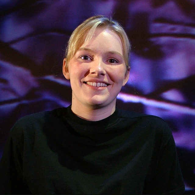
Lighting: Good, with expressive catchlights, but would have been better with a reflector bouncing the light back up from below to soften the shadows.
Pose: she just jumps right out and says 'hi' doesn't she. I would have place her face more toward the upper-left third and not cut off her arm.
Background: very busy, with not enough separation between the black shirt and the dark spots in the background.
Lighting appears to be a bit harsh, resulting in shadows on her face, neck, and chest. The BG is also a bit distracting. Good pose and focus, would like a bit of an off-centered approach but that's just me. This has a lot of potential with some minor lighting adjustments IMHO. :o)
really needs some more light to balance out your main source - the shadows on the cheek and eye sockets and under the hair could do with some balancing
I don't really like how the shirt fades into the background. I think it could be cropped closer. Lighting is good. Background is interesting, but I notice miniture pixalation in it. Is it a TV or a projecter?. Neat image or slight selective blurring whould have cleaned that up. Expression is good, got the sparkle in the eyes.
Good creative use of lighting. You do have some purplish cast in the shadows of her face though. Not sure what caused this. A white poster board reflector on that side would help with this I believe. I love that you managed to get the catch light in her eyes. Very important in a portrait. My biggest complaint with this shot though is that her outfit and the background kind of blend together. THis makes her look like a floating head which is not as pleasant an image as she deserves.
TC
The lighting isn't quite right here. There's a few shadows on her face that are noticeable which kind of makes one eye dark, and one eye light. Very natural expression though.
Your model is beautiful and I love the background. It is very original. I would like to see a different pose, though. Maybe turn the shoulders a quarter turn. The pose seems to be too straight on.
Very shiny, creased background overwhelms the model. She has a nice expression but the shadows in the lower portion of her face (under the apples of her cheeks and under her chin) are very unflattering.
The background is to distraction ... looks blury and takes my eyes from the subject. try also not to have thesubject in the midle ... more to the left or right would be better







 Add photograph to your favorites
 Add photographer to your favorites


 Photographer found comment helpful.


