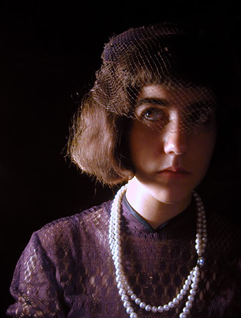
Thanks to all who commented. I appreciate receiving so many comments. I'm a bit disappointed that so many chose to comment about the lighting on the left side of her face. I intended the half-lighting. It is not an uncommon type of portrait lighting so I'm not sure why so many chose to give advice as to how to add fill-light. I actually have other shots from this sitting where her whole face is lit. I used three separate lights.
I thought it was quite obvious that I intended the lighting (some people got it so I wasn't that far off) so those kind of comments just kind of irritate after the third or fourth one. If I had lit her whole face, I would have lost the mood I was aiming at.
Lighting: Needs a reflector to bounce light back onto the left side of the face and hair. The catchlight in her right eye is fine, but she needs on in her left. The light on her neck is a bit hot.
Pose: The pose is fine, but if her head was turned a bit to the right, the light would be able to fall more uniformly on the left side of her face and would not create the heavy shadows under her hair on her right.
Background: The black works well, but would prefer more separation between her and the background.
Every time I look at this, I try and figure out just how old she is. The lighting, costume and old school portrait framing, make it hard to determine! Great shot.
TC
A case where (personally) I'd like a more descriptive title. There's obviously something going on besides someone sitting for a formal portrait -- I'm curious as to what it is.
What an odd, wonderful portrait! Make you wonder who is Margaret, she must have a story to tell. She's too old for pure dress ups, too young to really wear this get up. He strange expression adds to the mystery. The phoot itself is really well done, the lighting enhances the drama and makes her look more trapped in her odd life. Her upward glance is tentative to the point of being afraid. Great work!
This has a sort of VIctorian appeal to it. I like the choice of costume and hat. The portrait is too dark on her right side, IMHO. I would rather see a bit more detail all over than just on one side. The light seems to blow out on the pearls a bit. This does have potential, perhaps with minor lighting adjustments. :o)
this is an interesting composition. the clothing is very period, and i think it would have suited an B&W / sepia type aged look very well (but obviously wouldn't fit the challenge). i like the lighting, and i like how she's off-centre. i'm not all that keen on the background - it's just too oppressing because there is too much black. i'm also not too sure that for a portrait, looking up to the left while face is at the camera works too well. minor other thing (something i've been told off for too) the clasp from the necklace seems a bit distracting - putting it behind her neck might help. what this does have though is ample style and a fair amount of flair and originality. from me, it gets a 7
The necklace looks out of place and quite distracting, the eyes should have been more bright. In portraits the eyes are what should attract attention first.







 Add photograph to your favorites
 Add photographer to your favorites


 Photographer found comment helpful.


