|
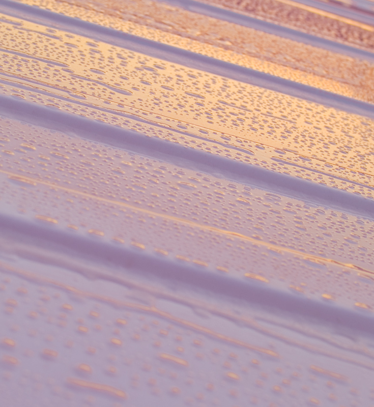
Good gradient with complimentary colors... the blue to the orange is good. It is somewhat high key but I think it comes from the muted pastel colors. I think I would like to see a smaller aperture (f11-f22) to compare because more than two thirds of the shot is OOF due to the depth of field created. |





 Add photograph to your favorites
 Add photographer to your favorites


 Photographer found comment helpful.

