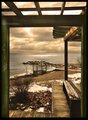
Well this is embarrassing. I feel like I dodged a bullet getting this score with the hack job I did processing this image. I had the image below posted and ready to go for this challenge and decided not to use it because it looks too much like a couple of images I have submitted before which are already on my home page. I rate diversity of profile higher than placement or score at DPC. So this image I submitted went from a RAW image to posting during the last five minutes of the submission phase. Not my finest hour when it comes to processing, and I won't make the same mistake again :-)
Statistics
Place: 26 out of 127 Avg (all users): 6.1852 Avg (commenters): 6.7143 Avg (participants): 5.8113 Avg (non-participants): 6.4268 Views since voting: 1157 Views during voting: 259 Votes: 135 Comments: 12 Favorites: 0
Brent you got an overall score of 6.1.
The framing is interesting. It's a nice picture.
I don't understand what you have to be embarassed about.
Thanks Penny :-) Well.....what I am embarrassed about is the processing. I spent about 3 minutes PP this image and it shows- I cringed when I looked at it posted and the voting had already begun. I lightened the shadows too much in the sculpture, there was no need to do this and it looks artificial. There was an airplane trail in the upper left corner (long exposure) that I cloned out but left a speck of at the corner of the sculpture and it looks like a nasty sharpening artifact. Some curve adjustments could have removed some of the atmospheric haze. I oversharpened the image and used a bad setting for USM that left an ugly halo around the sculpture and I even applied some sharpening after putting in the black canvas frame which gives it an unappealing halo too. I'm not embarrassed about the scene I captured (I slithered through bushes between a fence to get it), but the finer details of processing here are quite bad and nothing to be proud of.
This is a beautiful place to take pictures. although it looks to me, although it may just be the computer im using, that there is a lot of editing dont to this. It actually seems a little over edited. Its nice to see a shot from seatle! Good luck!
Nice catch, nice framing, like the composition. However, the main subject being the mountain, it's looks "flat" from the haze of the atmosphere. The foreground elements look sharper and better contrast than the mountain. There's a little bit of haloing around the art piece that frames the mountain too. This has great potential. I'm not a big post processor, so I couldn't tell you how to fix these critiques. Best of luck on the voting.






 Add photograph to your favorites
 Add photographer to your favorites


 Photographer found comment helpful.


