Youth, The Young, Innocence, Lost, Found, Searching,
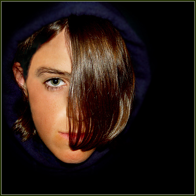
Lit with flash, although I tried many different ideas (including black light, blue flashlight, dulled indoor light). One of 87 images taken.
Post processing consisted of: Levels, lots of healing/cloning hairs out of the left side of the face, burning, blurring hood, blurring and completly obscuring background, resize to 630, sharpening, resize canvas to 632 with white bg, resize 640 w/black bg. Save for web 85 quality.
Statistics
Place: 47 out of 92 Avg (all users): 5.6017 Avg (commenters): 5.6000 Avg (participants): 5.1343 Avg (non-participants): 5.7816 Views since voting: 878 Views during voting: 364 Votes: 241 Comments: 26 Favorites: 0
This takes me back to the late 80's. I never could do this haircut, my hair is too waivy. Very Thompson Twins though. Great lighting. Love the catch light in the visible eye!
TC
im so glad we had a portrait challenge, which i did enter with my first attempt. I have learned alot about being creatve, lighting and backround from shots like this one. sorry if i cant help with suggestions on how to make this better.
the background and sweatshirt / clothing is all too black - makes the head seem a bit disembodied. there doesn't also appear to be any reason for the off-centre compositon - kids appearance is largely spherical, and a centred composition might work better. picture overall appears a bit weird, and the fringe is not particular portrait-friendly.
Wow! Your model's face is stunning! The background works very well but I am not happy with the blue boder that surrounds her head. Lighting = well done. Border = not needed.
It's not a "traditional studio portrait". I think that will draw down your score.... your subject is pretty... hair is interesting... just not "traditional".
Youth would see better with both eyes open.
If negative space was on the left, image would have more balance. I think Rule of Thirds doesn't work in most studio portraits.
Good exposure.
Interesting. I can't tell if this is an adolescent girl or boy. What I dislike is the rather disembodied appearance of the head and the crescent of blue-ish light just over the subject's head. It might be a hat--it's really hard to make out what it is---but it has the effect of flattening the top of the subject's head.






 Add photograph to your favorites
 Add photographer to your favorites


 Photographer found comment helpful.


