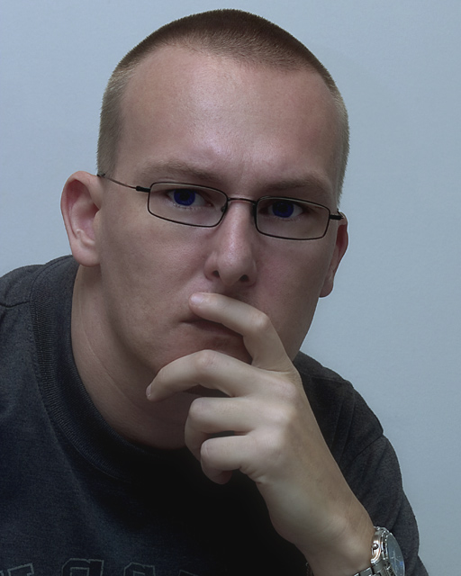
A nice shot but a classic error made. If you worked for a portrait studio you would have gotten in trouble for the finger covering the mouth. The pose is good, just need to brign the hand down so the mouth isn't covered. Also the lighting seems just a bit dull overall. I do like the intense expression in his eyes though. Nice capture. Started at a 5, moving to a 6
Very nicely composed/posed and framed. Your lighting gives a nice sense of depth, but is a little dull. Colors also are a bit dull. Crop wise, I am a tad bit distracted by the watch dial being cut off at the bottom. Also I would have cloned out the tops of the letters on his shirt. Nice job overall!
TC
Edited to add: Could definately benefit from catch light in his eyes.
Composition and exposure are good, but lighting appears flat. Without a compelling expression on the subject, dramatic lighting is almost a necessity to create interest. Either one or both would probably boost your score dramatically. BTW- I think I have the same watch. ;-)
The pose and most of the technical aspects of this photo are fine, however, I find the lighting to be a bit flat and dim on my monitor. I would have liked to see a bit more brightness in the face, possibly the catchlights in the eyes. I understand that with glasses, that is extremely difficult to pull off effectively. It is nice as it stands, but could be better with some lighting adjustment. Good effort. :o)
Interesting idea. A thoughtful pose. I'm sure you've heard this, but I would like a little better lighting. Composition is nice, watch is a bit annoying.
Looks a little underexposed and maybe a blue cast to it. His eye color isn't realistic. I like the pose, but maybe without the watch. Glasses are great.
Excellent lighting control (or removable lenses?) to shoot through the glasses with no reflections. I guess the "cold" lighting scheme suits the subject matter, but seems a little unusual for a portrait.
Lighting on his face is dynamic and well done but.... the eyes are way over-saturated. Photo is a bit flat also... a bright colored background would have went better with his skin tone.
The colors seem just a little flat. a bit more contrast and it appears to be a little on the cool side of the WB spectrum. Maybe a touch more light up into the eyes to eliminate the (very) slight shadow.
Lighting is a little flat. Good pose, but I don't like the hand in front of the mouth. Perhaps, just on his chin might have worked better. Also, try shining a light on the BG to make it blow out a little more, and help your subject stand out more.






 Add photograph to your favorites
 Add photographer to your favorites


 Photographer found comment helpful.


